Investigating content and audience reactions to youtube Super Bowl commercials ================
Introduction
The Super Bowl has top television ratings in the US, and its commercials are widely watched by US audiences. Thanks to the “like”, “dislike”, and “comment” features of Youtube, we are able to examine the interaction between the audience and the TV ads that were posted on Youtube. This motivated our team to explore the trends in how the content and audience preferences of Super Bowl ads change over the years, as well as how their content and description differ during the election and non-election years.
Our youtube dataset was analyzed by FiveThirtyEight, a website that
focuses on opinion poll analysis, politics, economics, and sports
blogging. The dataset contains a list of ads with matching videos found
on YouTube from the 10 brands that had the most advertisements in Super
Bowls from 2000 to 2020, according to superbowl-ads.com. The 10 brands
are Toyota, Bud Light, Hynudai, Coca-Cola, Kia, Budweiser, NFL, Pepsi,
Doritos, and E-Trade. We mainly focus on 7 defining characteristics of
each Super Bowl ad: funny, danger, use_sex,
show_product_quickly, celebrity, patriotic, animals, which are
represented as boolean variables. We will also use metrics like
view_count, like_count, dislike_count, favorite_count,
comment_count, description, and title of each ad to drive our
analysis.
Question 1:What is the trend of the ads’ content and audience preferences over the years?
Introduction
Many things have changed in the first 20 years of the 21st century. There are life science breakthroughs, political conflicts, feminist movements, etc. Therefore, we want to see if people’s reactions to Super Bowl commercials reflect the changes in their lifestyles and thoughts over the years. The changes in the ads themselves may also tell how companies are reacting to audience preferences.
We want to explore the trends in how the ads change over the years in
terms of content and audience preferences. To analyze the change in the
content we use the logical variables
funny,danger,use_sex,patriotic, show_product_quickly,
celebrity, and animals. To explore audience preference and
engagement,like_count and view_count are used to calculate the ratio
of like over total views.
Approach
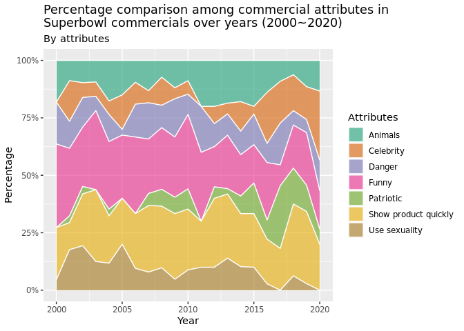
For the first plot, we used a stacked area chart to see the percentage
makeup of video attributes from 2000 to 2020. In order to compute the
percentage, we first count the total number of TRUE values for each
attribute in a year and then divide it over the total number of TRUE
values in that year. The percentage adds up to one as we are not
dividing over the total number of rows. The percentages we get using the
above method are then grouped by year and plotted as a stacked area
chart. We preferred this visualization over the stacked bar chart since
the stacked area chart makes it easier to identify the change, if any,
in the trend of content proportions over the years.
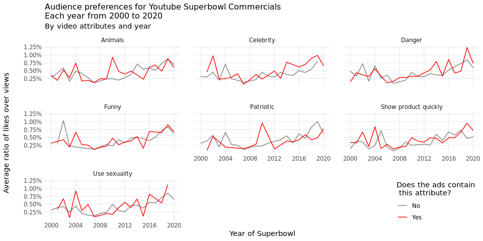
For the second plot, we used line graphs faceted by attribute, a
variable that is created using all logical variables in the data set.
The faceted line graph is suitable for time-dependent changes by each
attribute. We would like to see whether containing a certain
attribute impacts audience preference for an ad in each year. In each
year, all ads are divided into 2 groups: having a certain attribute or
not. In each group, The sum of the ratio of “likes” over “views” is
divided over the total number of ads in that group to achieve the
average ratio of “likes” over “views”. Therefore, the 2 lines in each
sub-plot clearly show how the trend of audience preference differs if an
ad contains an attribute or not over the years.
Analysis
Plot 1:
# First, group attributes by year and count total number of TRUE values
## by pivoting longer.
all_year <- youtube %>%
  drop_na(funny, show_product_quickly, patriotic, celebrity, danger, animals, use_sex) %>%
  pivot_longer(cols = c(funny, show_product_quickly, patriotic,
                        celebrity, danger, animals, use_sex),
               names_to = "attribute",
               values_to = "contain") %>%
  filter(contain == TRUE) %>%
  select(year, attribute, contain) %>%
  group_by(year, attribute) %>%
  summarise(attribute_occurence = n(), .groups = "drop")

# Change back the format to do rowwise percentage calculations.
all_year_summary <- all_year %>%
  pivot_wider(names_from = attribute, values_from = attribute_occurence) %>%
  replace(is.na(.), 0) %>%
  rowwise() %>%
  mutate(
    total = sum(c_across(animals:patriotic)),
    across(!c(year, total), ~ .x / total)
  ) %>%
  rename(
    "Animals" = "animals",
    "Danger" = "danger",
    "Funny" = "funny",
    "Show product quickly" = "show_product_quickly",
    "Use sexuality" = "use_sex",
    "Celebrity" = "celebrity",
    "Patriotic" = "patriotic"
  )
# Reformat to fit the plotting step
all_year_plot <- all_year_summary %>%
  select(!total) %>%
  pivot_longer(
    cols = !year,
    names_to = "Attributes",
    values_to = "Percentage")

# Plot Stacked Area chart
ggplot(all_year_plot,
       aes(x = year, y = Percentage, fill = Attributes)) +
  geom_area(alpha = 0.6 ,
            size = .5,
            colour = "white") +
  scale_y_continuous(
    labels = label_percent(
      accuracy = NULL,
      scale = 100,
      prefix = "",
      suffix = "%",
      big.mark = " ",
      decimal.mark = ".",
      trim = TRUE
    )
  ) +
  labs(
    x = "Year",
    y = "Percentage",
    fill = "Attributes",
    title = "Percentage comparison among commercial attributes in\nSuperbowl commercials over years (2000~2020)",
    subtitle = "By attributes"
  ) +
  scale_fill_brewer(palette = "Dark2")
Plot 2:
# create compare function for different
# Function was written with the help of TA
create_compare <- function(varname, full_data) {
  full_data <- full_data %>%
    # drop N/A value for key variables
    drop_na({
      {
        varname
      }
    }, like_count, view_count, dislike_count, comment_count) %>%
    # create new variables for preference, dislike, engagement, and attributes
    mutate(
      like = like_count / view_count,
      dislike = dislike_count / view_count,
      engage = comment_count / view_count,
      attribute = as_label(enquo(varname))
    ) %>%
    select({
      {
        varname
      }
    }, like, dislike, engage, attribute, year) %>%
    rename(val = as_label(enquo(varname)))
  return(full_data)
}
# create a new data frame that contains key variables
all_compare <- rbind(
  create_compare(funny, youtube),
  create_compare(danger, youtube),
  create_compare(show_product_quickly, youtube),
  create_compare(patriotic, youtube),
  create_compare(celebrity, youtube),
  create_compare(animals, youtube),
  create_compare(use_sex, youtube)
) %>%
  # change variable names to be more readable
  mutate(
    attribute = recode(
      attribute,
      'animals' = 'Animals',
      'celebrity' = 'Celebrity',
      'danger' = 'Danger',
      'funny' = 'Funny',
      'patriotic' = 'Patriotic',
      'show_product_quickly' = 'Show product quickly',
      'use_sex' = 'Use sexuality'
    )
  ) %>%
  group_by(year, attribute, val) %>%
  summarise(
    mean_like = mean(like),
    mean_engage = mean(engage),
    .groups = "drop"
  )
# plotting like vs. year
ggplot(all_compare, aes(x = as.numeric(year), y = mean_like)) +
  geom_line(aes(color = val)) +
  labs(
    title = "Audience preferences for Youtube Superbowl Commercials\nEach year from 2000 to 2020",
    subtitle = "By video attributes and year",
    x = "Year of Superbowl",
    y = "Average ratio of likes over views"
  ) +
  facet_wrap(~ attribute, nrow = 3) +
  scale_y_continuous(
    labels = label_percent(
      accuracy = NULL,
      scale = 100,
      prefix = "",
      suffix = "%",
      big.mark = " ",
      decimal.mark = ".",
      trim = TRUE
    )
  ) +
  scale_x_continuous(breaks = c(2000, 2004, 2008, 2012, 2016, 2020)) +
  theme_minimal() +
  scale_color_manual(
    "Does the ads contain\n this attribute?",
    values = c("#808080", "#FF0000"),
    labels = c("No", "Yes")
  ) +
  theme(
    axis.title.x = element_text(hjust = 0.5),
    axis.title.y = element_text(margin = margin(r = 20),
                                hjust = 0.5),
    panel.spacing = unit(1.5, "lines"),
    legend.position = c(0.9, 0.1),
    plot.title = element_text(size = 12),
    panel.grid.minor = element_blank()
  )
Discussion
Looking at the stacked area chart, we can get an overview of the video
attributes makeup. In general, funny and show_product_quickly take
up the highest proportion among the seven video attributes over years.
patriotic takes up the least proportion. We cannot generalize a clear
pattern just by using the stacked area chart since the width of each
color band is hard to measure and compare. However, this chart does give
us information about what are the most preferred attributes of Superbowl
commercials: showing products quickly and being funny. This makes sense
since Super Bowl commercials are usually expected to be humorous, and
showing the product quickly increases the company’s chances of
maximizing consumer exposure to their product, which is why these
attributes are the most prominent across the years.
Over the years, the trend of audience preference toward Super Bowl ads
depends on the attributes the ads contain. For example, the audience’s
love for patriotic ads peaked in 2010. 2010 was the year of the first
midterm election after Obama’s victory, which might explain this
increase. Furthermore, in specific years, the audience has strong
feelings toward ads that contain certain attributes. For instance, in
2002, ads that do not contain funny received higher percentage of
likes than the ones that contain funny. In this case, it is possible
that the terrorist attack in 2001 had changed the national sentiment, so
the audience consider funny videos less appropriate during that time.
Combining the line graphs with the stacked area plot, we discover
interesting matches and unmatches between attributes proportion and
audience reactions. For example, a corresponding match appears in
attribute celebrity where celebrity-included ads have become popular
with higher percentage since 2015, which coincides with the increasing
audience preference by observing the interaction data in plot two.
However, things are not always matched. When the proportion of funny
videos grew from 2000 to 2003, audiences tend to prefer videos that do
not contain humor. Similarly, danger in the last 5 years has narrowed
its width in the stacked area chart while the audience tends to hit like
more often for ads containing danger. There can be many underlying
reasons, but our guesses reside in the different expectations between
the audience and ad companies in which relevant regulations prevent
companies from catering to their audience on dangerous content.
Question 2 How do election year ads differ from non-election year ads in terms of content and description?
Introduction
Our second question aims to explore the difference, if any, between ads
aired during election years compared to those aired during non-election
years. Particularly, we want to analyze if there is any noticeable
difference in the description and content between the election and
non-election year ads. Answering this question involves looking at the
title variable to analyze how these ads were described, and then
analyzing the boolean content variables of use_sex,
patriotic,funny ,celebrity,danger, and animals to see if they
had any noticeable differences in their content. Finally, the year
variable is also needed to distinguish between election and non-election
years.
We are interested in exploring this question because election years mark a significant cultural moment in the US. Therefore, we want to see whether this focus on politics translates into any noticeable effect on super bowl ads.
Approach
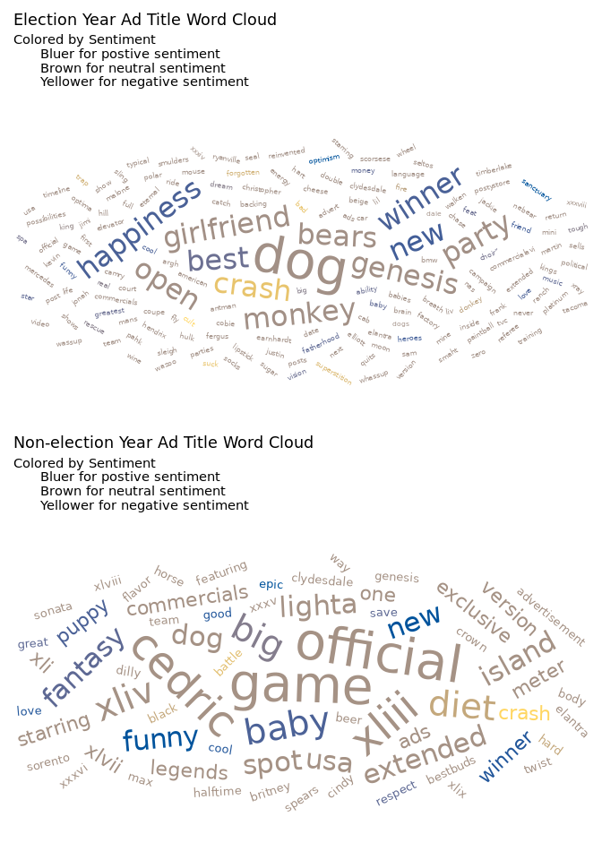
To analyze the description aspect of our question, we decided to use a
word cloud visualization since we felt it was the most informative way
to visualize what major descriptors are used for the ads. The
alternative way of analyzing title that we considered included a bar
char for top 10-20 words. However, we decided to opt for the word cloud
since it provided more information in terms of relative occurrences of
all the words being used (by size). Creating the word cloud involved
cleaning the text (for e.g turning all words lower, removing
punctuation, removing numbers) which was done by the tm library. We
also performed sentiment analysis on the words using the
get_sentiment() function and colored the word cloud based on the
words’ sentiment score. We used the syuzhet library for the
get_sentiment function since it assigned each word a sentiment score
and had the widest range of words that could be assigned a score i.e
largest word dictionary.
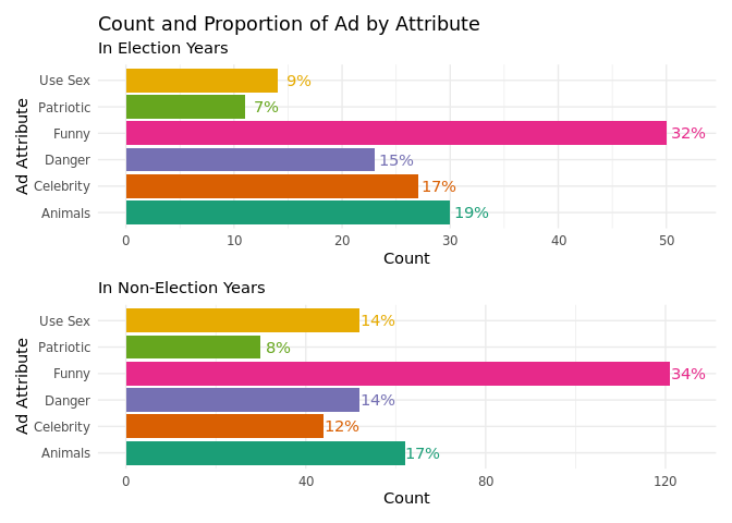
To analyze the content aspect, we decided to opt for a column graph with
percentage values of each content category as labels of the
visualization. Possible alternative that we considered was a pie chart
but since our column graph shows the percentage values as well as count
values, we decided to go for the visualization that maximized
information. For this plot, we decided to not use the
show_product_quickly attribute since it does not provide insight into
whether the content was different.
Analysis
# Election years in the dataset
election_year <- c(2000, 2004, 2008, 2012, 2016, 2020)
# Adding an election year variable
youtube <- youtube %>%
  mutate(election_years = ifelse(year %in% election_year, 1, 0))
# Data Wrangling steps
test <- youtube %>%
  filter(election_years == 1) %>%
  select(title)

word_cloud_viz <- function(testvector, freqCheck) {
  docs <- VCorpus(VectorSource(testvector))
  docs <- docs %>%
    # Removing numbers
    tm_map(removeNumbers) %>%
    # Removing punctuation
    tm_map(removePunctuation) %>%
    # Removing whitespace
    tm_map(stripWhitespace)
  docs <- tm_map(docs, content_transformer(tolower))
  docs <- tm_map(docs, removeWords, stopwords("english"))
  # Removing words that contain brand names
  docs <- tm_map(
    docs,
    removeWords,
    c(
      "super",
      "bowl",
      "commercial",
      "superbowl",
      "bud ",
      "light",
      "budweiser",
      "pepsi",
      "hyundai",
      "doritos",
      "coke",
      "cocacola",
      "cola",
      "coca",
      "kia",
      "toyota",
      "etrade",
      "nfl"
    )
  )
  dtm <- TermDocumentMatrix(docs)
  matrix <- as.matrix(dtm)
  words <- sort(rowSums(matrix), decreasing = TRUE)
  election_df <- data.frame(word = names(words), freq = words)
  election_df <- election_df %>%
    mutate(angle = sample(-45:45, nrow(election_df), replace = TRUE)) %>%
    filter(freq >= freqCheck) %>%
    # Package to get sentiment scores for each word in the dataset
    mutate(sentiment = get_sentiment(word, "syuzhet"))
  retPlot <- election_df %>%
    ggplot(aes(
      label = word,
      color = sentiment,
      size = freq,
      angle = angle
    )) +
    geom_text_wordcloud() +
    theme_minimal() +
    scale_color_gradient(low = "#FFD662FF", high = "#00539CFF")
  return(retPlot)

}
election_1 <- youtube %>%
  filter(election_years == 1) %>%
  select(title)

election_0 <- youtube %>%
  filter(election_years == 0) %>%
  select(title)

election_wc <- word_cloud_viz(election_1, 1)

nelection_wc <- word_cloud_viz(election_0, 2)

efinal <- election_wc +
  scale_radius(range = c(2, 15)) +
  labs(
    title = "Election Year Ad Title Word Cloud",
    subtitle = "Colored by Sentiment
      Bluer for postive sentiment
      Brown for neutral sentiment
      Yellower for negative sentiment"
  )

nefinal <- nelection_wc +
  scale_radius(range = c(3.5, 15)) +
  labs(
    title = "Non-election Year Ad Title Word Cloud",
    subtitle = "Colored by Sentiment
      Bluer for postive sentiment
      Brown for neutral sentiment
      Yellower for negative sentiment"
  )

efinal / nefinal
# Creating variable with election, using pivot_longer to get attributes in the
# same column, and creating a percentage variable
election_yr <- youtube %>%
  pivot_longer(cols = c(use_sex, funny, celebrity, patriotic, danger, animals)) %>%
  filter(election_years == 1) %>%
  filter(value == TRUE) %>%
  group_by(name) %>%
  summarise(n = n()) %>%
  mutate(perc = paste(round((n / sum(
    n
  )) * 100), "%", sep = ""))
# Creating the plot
elecyr <- election_yr %>%
  ggplot(aes(y = name, x = n, fill = name)) +
  geom_col(show.legend = FALSE) +
  geom_text(aes(label = perc, color = name),
            nudge_x = 2,
            show.legend = FALSE) +
  labs(
    x = "Count",
    y = "Ad Attribute",
    title = "Count and Proportion of Ad by Attribute",
    subtitle = "In Election Years"
  ) +
  scale_fill_brewer(palette = "Dark2") +
  scale_color_brewer(palette = "Dark2") +
  theme_minimal() +
  scale_y_discrete(labels = rev(
    c(
      "Use Sex",
      "Patriotic",
      "Funny",
      "Danger",
      "Celebrity",
      "Animals"
    )
  ))
# Creating variable with no election, using pivot_longer to get attributes in the
# same column, and creating a percentage variable
no_election_yr <- youtube %>%
  pivot_longer(cols = c(use_sex, funny, celebrity, patriotic, danger, animals)) %>%
  filter(election_years == 0) %>%
  filter(value == TRUE) %>%
  group_by(name) %>%
  summarise(n = n()) %>%
  mutate(perc = paste(round((n / sum(
    n
  )) * 100), "%", sep = ""))
# No Election year col vizualization
nelecyr <- no_election_yr %>%
  ggplot(aes(y = name, x = n, fill = name)) +
  geom_col(show.legend = FALSE) +
  geom_text(aes(label = perc, color = name),
            nudge_x = 4,
            show.legend = FALSE) +
  labs(x = "Count",
       y = "Ad Attribute",
       subtitle = "In Non-Election Years") +
  scale_fill_brewer(palette = "Dark2") +
  scale_color_brewer(palette = "Dark2") +
  theme_minimal() +
  scale_y_discrete(labels = rev(
    c(
      "Use Sex",
      "Patriotic",
      "Funny",
      "Danger",
      "Celebrity",
      "Animals"
    )
  ))

elecyr / nelecyr
Discussion
We can divide the discussion of our visualizations into two parts: comparison by description and comparison by content.
When comparing our two words clouds, it immediately becomes clear that there is some overlap in the words used in Superbowl Ad titles. These include, winner, new, and nfl. Similarly, there does not seem to be any major difference in the overall sentiment makeup of these words. We can gauge this by observing that both the word clouds have a few blue words (indicating positive sentiment), very few yellow words (indicating negative sentiment), and majority brown words (indicating neutral sentiment). This goes on to indicate that there is very little difference in the titles of superbowl ads in election years compared to non-election years. This result was surprising since our team was expecting the election titles to contain more patriotic words such as “America”, “Freedom”, and “Liberty” but it appears as if the ad titles are not significantly affected by election and non-election years.
We observed a similar relation when analyzing the content of election
and non-election year ads. For both these categories, there seemed to be
a marginal difference in the attribute makeup, indicating that even the
content of ads was very similar in election and non-election years.
However, it was interesting to note that use_sex attribute dropped
from 14% in non-election years to 9% in election years. While this could
be indicative of a slight variation in content, it more more likely that
this change was a coincidence.
Presentation
Our presentation can be found here.
Data
Mock, T 2021, Superbowl commercials, electronic dataset, tidytuesday, viewed 20 September 2021, https://github.com/rfordatascience/tidytuesday/blob/master/data/2021/2021-03-02/readme.md.
References
https://www.r-graph-gallery.com/136-stacked-area-chart https://cran.r-project.org/web/packages/syuzhet/vignettes/syuzhet-vignette.html https://cran.r-project.org/web/packages/ggwordcloud/vignettes/ggwordcloud.html