Visualizing Income Inequality in the United States
7-Up
Blossom Mojekwu, Kartik Chamarti, Margaret Reed, Phillip
Harmadi
Introduction
Our dataset comes from the Urban Institute and US Census and focuses on racial wealth inequality. We chose this dataset because wealth inequality is a very important issue in America, and it would be valuable to see the relationship between race and wealth over time in America. There are around 5-6 data files focused on the relationship between race and income over time.
For the purpose of answering the two questions below, we will be
focusing on the home_owner and income_mean data sets. The
home_owner data set will help us to visualize home-ownership rate
information for each race while the income_mean dataset will help us
to visualize the income earned for each income quintile for each race
during a particular time period.
1. How has home-ownership rate and wealth changed over time and vary between races?
Introduction
We want to investigate how homeownership rates have changed over time,
and how homeownership trends vary by race. We are interested in
understanding homeownership trends across racial groups because
homeownership is one of the biggest contributors to racial wealth
inequality. We decided to use the home_owner dataset and use the
year, race, and home_owner_pct variables because they will allow
us to plot homeownership percentages by race over time.
When it comes to home ownership in the US, a major event that has shaped
our parents’ lives and even ours to a certain extent was the great
recession around 2009 and the housing bubble caused by faulty mortgages.
For this context, we wanted to explore changes in homeownership
percentage a few years before and after the crash and see which races
have been particularly affected by it more. For this, we used
thehome_owner dataset and use the year, race, and home_owner_pct
variables.
Approach
When it comes to plotting information from 3 different variables, that includes a categorical variable, some of the most efficient plots would be a line plot and barplot. Line plots are best for displaying the change of a value, such as homeownership percentage, over the course of time. Thus, we used a line plot to plot the change of homeownership percentages by different racial groups (White, Hispanic, Black) from 1976-2016.
As previously mentioned, apart from just a line plot, the grouped barplot does an efficient job in comparing 3 different variables where one is categorical. When making an animated plot, the benefit of a grouped barplot is that it makes it very easy to see the exact percentages over time, which is ideal to see the exact changes in homeownership percentages across the years and racial groups. To make the bar plot easier to read, we added grey, vertical dotted lines with 2007 serving as the baseline for comparison. This makes it easier to determine whether or not the homeownership percentage value has decreased or increased relative to 2007
Analysis
lowest_year <- home_owner %>%
  group_by(year) %>%
  summarize(mean_pct_unweighted = mean(home_owner_pct)) %>%
  arrange(mean_pct_unweighted) %>%
  slice(1) %>%
  pull(year)

highest_year <- home_owner %>%
  group_by(year) %>%
  summarize(mean_pct_unweighted = mean(home_owner_pct)) %>%
  arrange(desc(mean_pct_unweighted)) %>%
  slice(1) %>%
  pull(year)

last_year <- home_owner %>%
  group_by(race) %>%
  filter(year == max(year))
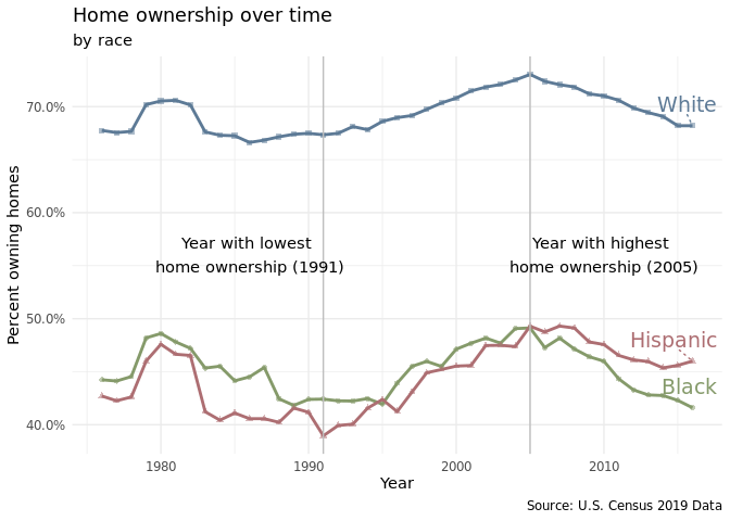
Plot 1.a
home_owner %>%
  ggplot(
    aes(x = year, y = home_owner_pct, color = race, shape = race)
  ) +
  geom_line(size = 1) +
  geom_point(alpha = 0.5, size = 1.5) +
  geom_vline(aes(xintercept = lowest_year), color = "grey") +
  geom_vline(aes(xintercept = highest_year), color = "grey") +
  annotate(geom = "text",
    x = lowest_year - 5,
    y = 0.56,
    label = paste0("Year with lowest \nhome ownership (", lowest_year, ")"),
    color = "black"
    ) +
  annotate(
    geom = "text",
    x = highest_year + 5,
    y = 0.56,
    label = paste0("Year with highest \nhome ownership (", highest_year, ")"),
    color = "black"
    ) +
  geom_text_repel(data = last_year,
                  aes(label = race),
                  direction = "y",
                  nudge_x = 2,
                  nudge_y = 0.02,
                  size = 5,
                  segment.linetype = "dotted") +
  scale_color_manual(values = c("#859a6a", "#ad6e72", "#5d7a96")) +
  scale_y_continuous(labels = scales::percent_format(scale = 100)) +
  labs(
    x = "Year",
    y = "Percent owning homes",
    title = "Home ownership over time",
    subtitle = "by race",
    caption = "Source: U.S. Census 2019 Data"
  ) +
  theme_minimal() +
  theme(legend.position = "none")
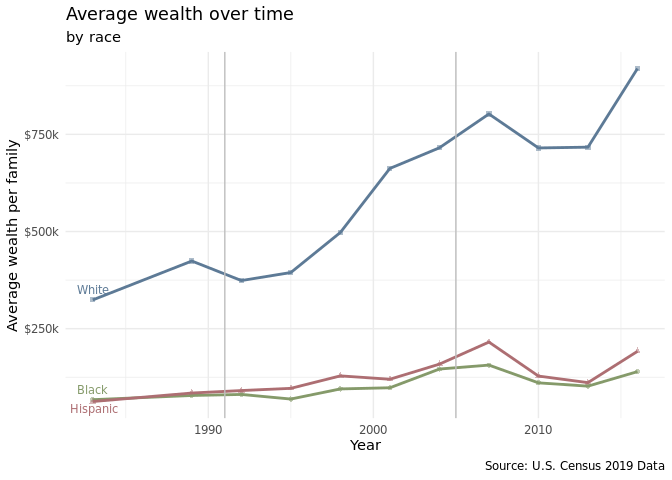
Plot 1.b
first_year <- race_wealth %>%
  filter(type == "Average",
         race != "Non-White",
         year > 1980) %>%
  group_by(race) %>%
  filter(year == min(year))
race_wealth %>%
  filter(type == "Average",
         race != "Non-White",
         year > 1980) %>%
  drop_na() %>%
  group_by(race, year) %>%
  ggplot(aes(x = year, y = wealth_family, color = race, shape = race)) +
  geom_point(alpha = 0.5, size = 1.5) +
  geom_line(size = 1) +
  geom_text_repel(data = first_year,
                  aes(label = race),
                  direction = "y",
                  nudge_y = 1000,
                  size = 3,
                  segment.linetype = "dotted") +
  geom_vline(aes(xintercept = lowest_year), color = "grey") +
  geom_vline(aes(xintercept = highest_year), color = "grey") +
  scale_color_manual(values = c("#859a6a", "#ad6e72", "#5d7a96")) +
  scale_y_continuous(labels = scales::label_number(big.mark = ",",
                                                   scale = 0.001,
                                                   suffix = "k",
                                                   prefix = "$")) +
  labs(
    x = "Year",
    y = "Average wealth per family",
    title = "Average wealth over time",
    subtitle = "by race",
    caption = "Source: U.S. Census 2019 Data"
  ) +
  theme_minimal() +
  theme(legend.position = "none")
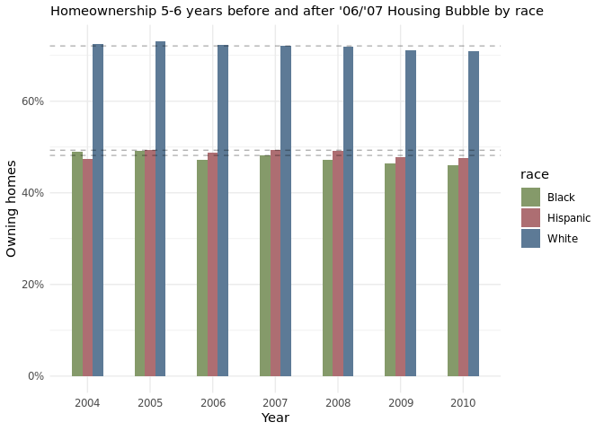
Plot 1.c
home_owner %>%
  filter(year > "2003", year <= "2010") %>%
  dplyr::group_by(year, race) %>%
  dplyr::summarise(avg_h_o = mean(home_owner_pct), .groups = 'drop') %>%
  ggplot(aes(x = as.factor(year), y = avg_h_o, fill = race)) +
  geom_bar(width = 0.5, position = "dodge", stat = "identity") +
  geom_hline(aes(yintercept = 0.7207117), linetype = "dashed", alpha = 0.3) +
  geom_hline(aes(yintercept = 0.4816776), linetype = "dashed", alpha = 0.3) +
  geom_hline(aes(yintercept = 0.4930240), linetype = "dashed", alpha = 0.3) +
  scale_fill_manual(values = c("#859a6a", "#ad6e72", "#5d7a96")) +
  scale_y_continuous(labels = scales::percent_format(scale = 100)) +
  labs(
    x = "Year",
    y = "Owning homes",
    color = "Race",
    shape = "Race",
    subtitle = "Homeownership 5-6 years before and after '06/'07 Housing Bubble by race"
  ) +
  theme_minimal()
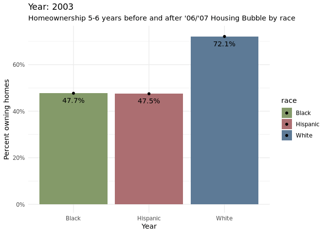
Plot 1.d
home_owner %>%
  filter(year >= "2003", year <= "2012") %>%
  dplyr::group_by(year, race) %>%
  ggplot(aes(x = race, y = home_owner_pct, fill = race))+
    geom_bar(position = "dodge", stat = "identity") +
  geom_text(aes(label = percent(home_owner_pct, accuracy = 0.1)),
            position="stack",vjust= 2)+
  geom_point() +
  scale_fill_manual(values = c("#859a6a", "#ad6e72", "#5d7a96")) +
  scale_y_continuous(labels = scales::percent_format(scale = 100)) +
  labs(
    x = "Year",
    y = "Percent owning homes",
    color = "Race",
    shape = "Race",
    subtitle = "Homeownership 5-6 years before and after '06/'07 Housing Bubble by race"
  ) +
  theme_minimal() +
  transition_time(year) +
  labs(title = "Year: {round(frame_time)}")
Discussion
The line plot shows that there is a consistent racial disparity in homeownership percentages between Whites and Hispanics and Whites and Blacks. Upwards of 65% of White Americans have consistently owned homes from 1976-2016. Meanwhile, for the same years, lower than 50% of Hispanics and Blacks have owned homes. After 2005, a greater percentage of Hispanics own homes compared to Blacks. There are many possible reasons for the racial disparity in homeownership rates such as the fact that White families tend to have greater wealth than Hispanic and Black families and that White individuals are more likely to receive inheritances than other minority groups which can be used for home down payments (Bhutta et al.).
Around 2007, the homeownership percentages started to decrease across all racial groups(Black, Hispanic, White), which makes sense as it was the start of when there were a lot of foreclosures. Treating 2007 as the baseline, it is apparent that hispanic and black communities were significantly more affected by the foreclosures than white communities. This is apparent from the bar chart as there is a larger decrease in homeownership percentages for the two racial groups compared to the white demographic. Through the animated grouped bar chart, it can be noticed that for the most part that homeownership percentages have not gone back to the levels at which it was before the housing bubble, based on the most recent data collected at 2016.
Citation: Bhutta, Neil, Andrew C. Chang, Lisa J. Dettling, and Joanne W. Hsu (2020). “Disparities in Wealth by Race and Ethnicity in the 2019 Survey of Consumer Finances,” FEDS Notes. Washington: Board of Governors of the Federal Reserve System, September 28, 2020, https://doi.org/10.17016/2380-7172.2797.
2. How do household income levels compare between races and within each race?
Introduction
Most income inequality research focuses on the income disparity between
different races, for example, how Asian Americans and White Americans
typically have higher income as compared to African Americans and
Hispanic/Latino Americans. There is significantly less research focusing
on the income disparities within each of the races. We are trying to
figure out the degree of income inequality for each of the races within
their own community. In this question, we will be using
income_mean.csv. This data set is sufficient since it provides us with
the income information for each household quintile, year, and race. We
will be using the following variables: year, race,
income_quintile, and income_dollars which will be explained further
in the “Approach” section.
Approach
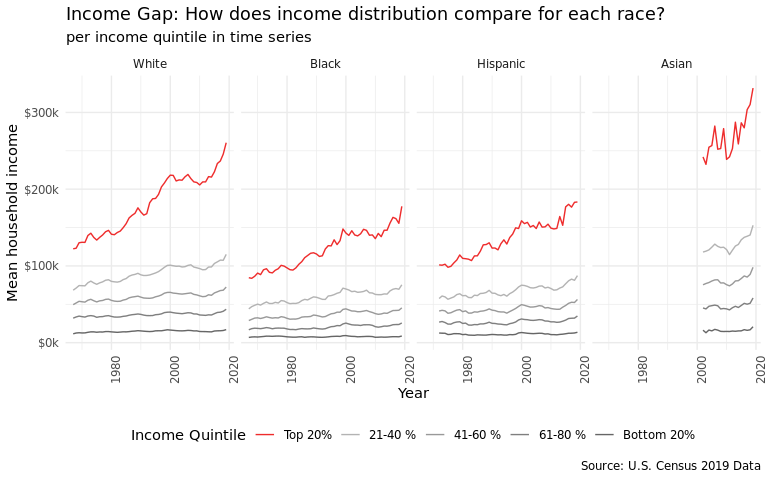
Average income distribution by race has changed over time. We chose a line plot and decided to facet by race with year on the x axis and average income amount on the y axis. We cared less about looking into specific years and more about overall trends and comparisons within each race. To clean the data for this visualization, we filtered out race categories that included combinations and the “all” category. This left us with 4 levels: Whites, Blacks, Hispanics, and Asians. We wanted to highlight the top earners in each racial category- so we colored them in red. Something interesting to note is that data collection for Asian observations only started around 2000. It is hard to easily compare differences between races, so we decided to zoom into 2019 and make a bar chart.
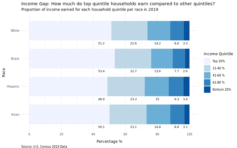
Average income for each income quintile by race. We chose a bar bar graph because we are trying to compare how much more the top 20% of earners mae than those who make less for each racial group, and understand which race has the highest gap (through a stacked filled bar chart). A bar graph is ideal since we can group or stack them together and color them based on the income quintile variable, making the visualization easier to be understood by readers.
Analysis
income_mean <- income_mean %>%
  filter(
    !str_detect(race, "Combination"),
    !str_detect(race, "Not Hispanic"),
    !str_detect(race, "All"),
    dollar_type == "2019 Dollars",
    income_quintile != "Top 5%"
    ) %>%
  group_by(year, race, income_quintile) %>%
  summarize(income_dollars =  mean(income_dollars), .groups = "drop") %>%
  mutate(
    race = str_remove(race, ',?\\s(.*)'),
    income_percentile = case_when(
      income_quintile == "Top 5%"   ~ "1st - 5th",
      income_quintile == "Highest"  ~ "Top 20%",
      income_quintile == "Fourth"   ~ "21-40 %",
      income_quintile == "Middle"   ~ "41-60 %",
      income_quintile == "Second"   ~ "61-80 %",
      income_quintile == "Lowest"   ~ "Bottom 20%"),
    income_percentile = ordered(income_percentile,
                                c("Bottom 20%", "61-80 %", "41-60 %",
                                    "21-40 %", "Top 20%")),
    race = ordered(race, c("White", "Black", "Hispanic", "Asian")))
make_perc_table <- function(quintile) {
  return(
    income_mean %>%
      filter(year == 2019) %>%
      group_by(race) %>%
      transmute(income_quintile,
                percent = income_dollars / sum(income_dollars)) %>%
      filter(income_quintile == quintile)
  )
}

highest_perc_table <- make_perc_table("Highest")
perc_21_40_perc_table <- make_perc_table("Fourth")
perc_41_60_perc_table <- make_perc_table("Middle")
perc_61_80_perc_table <- make_perc_table("Second")
bottom_perc_table <- make_perc_table("Lowest")
Plot 2.a
income_mean %>%
  ggplot(
    aes(
      x = year,
      y = income_dollars,
      color = income_percentile
      )
  ) +
  geom_line() +
  facet_wrap(. ~ race, nrow = 1) +
  scale_y_continuous(labels = scales::label_number(big.mark = ",",
                                                   scale = 0.001,
                                                   suffix = "k",
                                                   prefix = "$")) +
  scale_color_manual(values = c("grey40", "grey50", "grey60", "grey70",
                                "firebrick2")) +
  labs(
    title = "Income Gap: How does income distribution compare for each race?",
    subtitle = "per income quintile in time series",
    x = "Year",
    y = "Mean household income",
    color = "Income Quintile",
    caption = "Source: U.S. Census 2019 Data"
    ) +
  theme_minimal() +
  theme(
    legend.position = "bottom",
    axis.text.x.bottom = element_text(angle = 90)
    ) +
  guides(color = guide_legend(reverse = TRUE))
Plot 2.b
income_mean %>%
  filter(year == 2019) %>%
  ggplot(
    aes(x = income_dollars, y = reorder(race, desc(race)))
    ) +
  geom_bar(
    position = "fill",
    stat = "identity",
    aes(fill = income_percentile),
    width = 0.7
    ) +
  geom_text(
    data = highest_perc_table,
    aes(y = race, label = paste0(round(percent, 3) * 100)),
    x = 0.45,
    size = 2.5,
    color = "black",
    nudge_y = -0.45
    ) +
  geom_text(
    data = perc_21_40_perc_table,
    aes(y = race, label = paste0(round(percent, 3) * 100)),
    x = 0.65,
    size = 2.5,
    color = "black",
    nudge_y = -0.45
    ) +
  geom_text(
    data = perc_41_60_perc_table,
    aes(y = race, label = paste0(round(percent, 3) * 100)),
    x = 0.80,
    size = 2.5,
    color = "black",
    nudge_y = -0.45
    ) +
  geom_text(
    data = perc_61_80_perc_table,
    aes(y = race, label = paste0(round(percent, 3) * 100)),
    x = 0.92,
    size = 2.5,
    color = "black",
    nudge_y = -0.45
    ) +
  geom_text(
    data = bottom_perc_table,
    aes(y = race, label = paste0(round(percent, 3) * 100)),
    x = 0.975,
    size = 2.5,
    color = "black",
    nudge_y = -0.45
    ) +
  scale_fill_brewer(type = "seq", palette = "Blues", direction = -1) +
  labs(
    title = "Income Gap: How much do top quintile households earn compared to other quintiles?",
    subtitle = "Proportion of income earned for each household quintile per race in 2019",
    x = "Percentage %",
    y = "Race",
    fill = "Income Quintile",
    caption = "Source: U.S. Census 2019 Data"
    ) +
  scale_colour_viridis_d() +
  scale_x_continuous(
    labels = scales::label_number(
      big.mark = ",",
      scale = 100,
      suffix = "",
      prefix = ""
      ),
    breaks = seq(-0.2, 1.2, 0.2)
    ) +
  guides(fill = guide_legend(reverse = TRUE)) +
  theme_minimal(base_size = 10) +
  theme(
    text = element_text(size = 9),
    axis.title.x = element_text(vjust = -2),
    plot.caption = element_text(vjust = -3, hjust = 0))
Discussion
From the 1st plot, we found that those who are Asian tended to have the highest average income, and their top 20% made far more than the other racial groups. Overtime, income disparities in all the racial categories increased when considering the top 20% of income earners. This increase in disparity seemed to be most noticeable for White households. We suspect that generally income is the highest among Asians due to their high educational attainment on average, and lowest in Black individuals due to the systemic disadvantages they have experienced throughout U.S. history.
From the 2nd plot, we can roughly surmise that income inequality is the highest within Black households and lowest within Hispanic households. Our speculation is that income inequality is highest among the Black category on average, because of lack of high-paying jobs and opportunities for Black individuals living in the rural Southern States vs. those living in Northeastern or Midwestern urban areas. For Asians, we speculate that income inequality is higher than Hispanics due to the different migration patterns and sources that Asian Americans’ ancestors came from. For example, Indian and Chinese Americans have a high proportion of professional college-educated citizens, while a lot of Southeast Asian Americans are doing blue-collared jobs and many came to the United States as refugees from less wealthy backgrounds.
Presentation
Our presentation can be found here.
Data
Nine Charts about Wealth Inequality in America (Updated), Urban Institute, viewed 13 September 2021, https://www.urban.org.
Historical Income Tables: Households, US Census, viewed 13 September 2021, https://www.usa.gov
References
List any references here. You should, at a minimum, list your data source.
Our data comes from the Urban Institute and the US Census.
The US Census provides Historical Income Tables, of which we have joined several to compare wealth and income over time by race.