Quality of U.S. Public Parks
The Scatterplots
Introduction
Our dataset comes from The Trust for Public Land’s ParkScore Index, an annually released report which ranks the parks of the 100 most populated cities in the United States according to 4 key metrics: access, investment, amenities, and acreage. There are 713 rows and 28 columns in the data set ranging from 2012 through 2020.
The COVID-19 Pandemic has laid bare a multitude of inequities that exist in the United States. While many people were able to flock to their local parks in order to get out of the house, many others were not. Our group is interested in exploring the Parks Access dataset in order to answer questions regarding access and equity to the nation’s largest cities’ parks. The Citylab article accompanying the dataset from TidyTuesday discussed a number of reasons for unequal access to quality parks and we are hoping to explore these in our project.
What is the relationship between spending per resident and park size in different U.S. regions and/or cities over time?
Introduction
To answer our first question, we used the parks dataset and analyzed
the relationship between the variables spend_per_resident_data,
city, med_park_size, and year. We thought it would be interesting
to look into how city budgets have allocated money for spending on their
public parks and how this has varied across different US cities over the
course of nearly the last decade. We also wanted to analyze how spending
per resident and park size varies across different U.S regions and
cities. We wanted to explore the relationship between these variables in
light of the COVID-19 pandemic, where people across the US flocked to
their local public parks. Namely, we wanted to see if the relationship
was one we would expect- where the more money spent on parks per capita,
the higher the median park size would be.
Approach
In order to ensure the final visualization had entries the variables of
interest for all years between 2012 and 2020, we did some data wrangling
first and removed all cities which had NAs for
spend_per_resident_data, city, and med_park_size_data. This left
us with a data frame with 4 columns: spend_per_resident_data, city,
med_park_size_data, and year. At this point, all that was left to do
was bin the data into quartiles for spending and for median park size.
In order to bin the data appropriately, we used the fivenum command to
find the quartiles in our data. This allowed us to analyze how spending
trends shifted between 2012 and 2020 for each quartile, as well as
visualize whether higher per capita spending resulted in larger median
park size. While we initially felt that a line graph would be
appropriate for this visualization, we quickly found that a line graph
yielded a plot that was overwhelming and uncompelling. As such, we
switched gears and decided to animate a scatterplot which allowed us to
visualize the quartiles for both size and spending next to each other
and see how these two things correlated to median park size and spending
over the span of 2012 and 2020.
For the second graph, we wanted to consider the variables of
med_park_size_data and spend_per_resident at the regional level as
opposed to city level. We hoped that this visualization would discern
differences between regions. To complete this goal, we first created a
new variable called region using mutate and case_when. We
referenced the National Geographic “United States Region” Map, which
resulted in 5 regions: West, Southwest, Midwest, Southeast, and
Northeast. After each city had a region connected with it in the
dataset, we grouped by year and region to complete the summarize
function. We then calculated the mean spending per resident for each
region during each year and the mean median park size for each region
during each year. We then plotted these means on a line plot over year
on the x-axis and mean spending per resident on the y-axis, grouped by
year. We used the size aesthetic to show the mean median park size
because it made aesthetic sense for a size-based variable to be mapped
to a size aesthetic. This yielded a lineplot, that we noticed had
similar features to the Napoleon plot.
Analysis
# data wrangling
# to remove the $ and change from a categorical variable to a numerical variable
# selected relevant variables, pivot wider to see what cities have data from every year
# drop na's from cities that do not have spending data from every year
# pivot longer to return dataset to a structure that can be plotted on a line plot

parks_q1 <- parks %>%
  select(year, city, spend_per_resident_data) %>%
  mutate(across(starts_with("spend_per_resident_data"), ~gsub("\\$", "", .)
                  %>% as.numeric)) %>%
  pivot_wider(names_from = "year",
              values_from = "spend_per_resident_data") %>%
  drop_na() %>%
  pivot_longer(cols = starts_with("20"),
               names_to = "year",
               values_to = "spend_per_resident")

# making the year variable numeric so we can join med_park_size_data back
parks_q1 <- parks_q1 %>%
  mutate(year = as.numeric(year))


# joining based on city and year to include med_park_size_data in the dataset
parks_q1 <- parks %>%
  select(city, year, med_park_size_data) %>%
  right_join(parks_q1, by = c("city","year"))

fivenum(parks_q1$spend_per_resident)
## [1] 15 62 94 134 399
fivenum(parks_q1$med_park_size_data)
## [1] 0.8 3.0 4.8 7.3 16.7
# creating quartile bins for spending per resident, ranges based on five number summary
parks_q1 <- parks_q1 %>%
arrange(city) %>%
mutate(spending = case_when(
between(spend_per_resident, 0, 62) ~ "1st quartile",
between(spend_per_resident, 63, 94) ~ "2nd quartile",
between(spend_per_resident, 95, 134) ~ "3rd quartile",
TRUE ~ "4th quartile"
))
# creating quartile bins for median park size, ranges based on five number summary
parks_q1 <- parks_q1 %>%
mutate(size = case_when(
between(med_park_size_data, 0, 3.0) ~ "1st quartile",
between(med_park_size_data, 3.01, 4.8) ~ "2nd quartile",
between(med_park_size_data, 4.81, 7.3) ~ "3rd quartile",
TRUE ~ "4th quartile"
))
# plot of median park size vs spending per resident over time
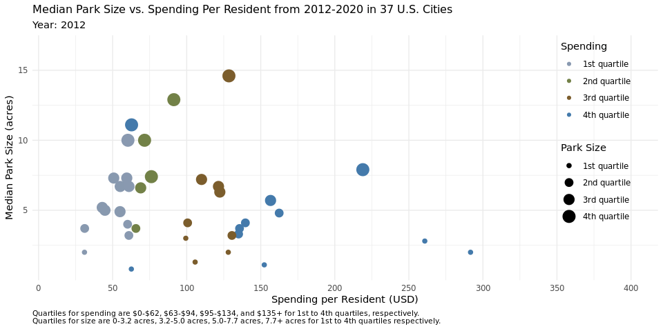
q1_plot<- ggplot(parks_q1, aes(x = spend_per_resident, y = med_park_size_data,
group = city)) +
geom_point(aes(size = size, color = spending)) +
labs(title = "Median Park Size vs. Spending Per Resident from 2012-2020 in 37 U.S. Cities",
subtitle = "Year: {frame_time}",
x = "Spending per Resident (USD)",
y = "Median Park Size (acres)",
size = "Park Size",
caption = "Quartiles for spending are $0-$62, $63-$94, $95-$134, and $135+ for 1st to 4th quartiles, respectively.
Quartiles for size are 0-3.2 acres, 3.2-5.0 acres, 5.0-7.7 acres, 7.7+ acres for 1st to 4th quartiles respectively.",
color = "Spending") +
theme_minimal()+
theme(plot.caption = element_text(size = 8, hjust = 0),
plot.title = element_text(size = 12),
legend.key.size = unit(.65, 'cm'),
legend.position = c(.9,.6)) +
scale_x_continuous(breaks = seq(from = 0, to = 400, by = 50)) +
scale_y_continuous(breaks = seq(from = 0, to = 20, by = 5)) +
scale_color_manual(values = c("#8999b0","#738148","#7c5d2d","#447aab")) +
transition_time(as.integer(year), range = c(2012L, 2020L))
animate(q1_plot, duration = 18)
## Warning: Using size for a discrete variable is not advised.
# data wrangling
# mutate new variable `regions` based off what region the city is located in

parks_regions <- parks_q1 %>%
  mutate(region = case_when(
          city %in% c("Boston", "Long Beach", "New York", "Philadelphia") ~
           "Northeast",
          city %in% c("Atlanta", "Baltimore", "Jacksonville", "Louisville",
                    "Memphis", "Nashville", "Virginia Beach") ~ "Southeast",
          city %in% c("Chicago", "Columbus", "Detroit", "Kansas City",
                     "Milwaukee") ~ "Midwest",
          city %in% c("Albuquerque", "Austin", "Dallas", "El Paso",
                     "Fort Worth", "Houston", "Mesa", "Oklahoma City",
                     "Phoenix", "San Antonio", "Tucson") ~ "Southwest",
          city %in% c("Denver", "Fresno", "Las Vegas", "Los Angeles",
                     "Portland", "Sacramento", "San Diego", "San Francisco",
                     "San Jose", "Seattle") ~ "West"))

# group by region and year, then summarize mean of spending per resident and median park size
parks_regions <- parks_regions %>%
  group_by(region, year) %>%
  summarize(mean_spend = mean(spend_per_resident),
            mean_med_size = mean(med_park_size_data))
## `summarise()` has grouped output by 'region'. You can override using the `.groups` argument.
# create a simplified data set to annotate
regions <- parks_regions %>%
count(year, region, mean_spend) %>%
filter(year == 2019)
# plot of mean spending per resident with respect to mean of median park size over time
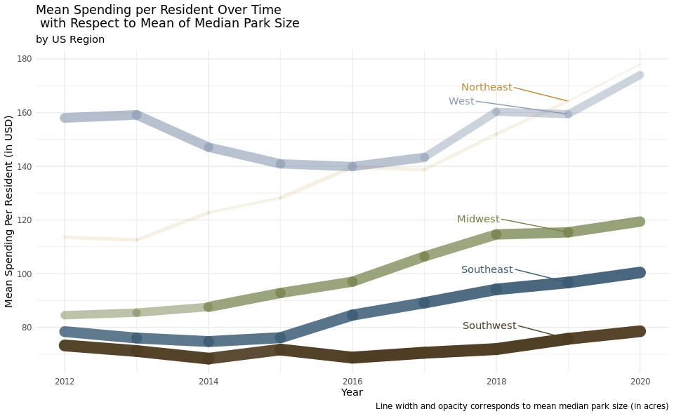
ggplot(data = parks_regions,
aes(x = year, y = mean_spend, group = region)) +
geom_line(aes(size = mean_med_size, alpha = mean_med_size, color = region), lineend = "round",
show.legend = FALSE) +
geom_text_repel(data = regions,
aes(label = region, color = region),
show.legend = FALSE,
nudge_y = 5,
nudge_x = -1.75,
hjust = -.5) +
scale_color_manual(values = c("#738148",
"#bc8a31",
"#3b5c75",
"#4f3e23",
"#8999b0")) +
scale_y_continuous(breaks = seq(from = 0, to = 180, by = 20)) +
labs(title = "Mean Spending per Resident Over Time\n with Respect to Mean of Median Park Size",
subtitle = "by US Region",
x = "Year",
y = "Mean Spending Per Resident (in USD)",
caption = "Line width and opacity corresponds to mean median park size (in acres)") +
theme_minimal()
Discussion
We anticipated that the scatterplot would reveal that higher per capita spending on public parks would result in higher median park size, however we found that this was not the case upon plotting the data in figure 1. This plot elucidates the difference in median park size across the quartiles. We decided to calculate the quartiles across the years in the data set, not adjusted to a certain year or recalculated on an annual basis because we felt this would be the most accurate way to see any change that happened over the years, such as cities switching from the third quartile to the second quartile for spending, for example. By keeping the dollar range which encompassed each quartile the same, we were able to visualize these changes on the animated plot. If we focus on the cities that are in the 4th quartile for spending, we notice that more than half of them are in the first quartile for median park size across the years. Inversely, if we look closely at the cities that are in the 3rd quartile for spending, more than half of the median park sizes are in the 4th quartile. This trend holds true across the spending quartiles, with the most pronounced display of this effect being in the first spending quartile, where nearly all the cities are in the 3rd quartile of median park size. This disproves our initial suspicion that higher per capita spending on park size would result in larger median parks, at the very least amongst the 37 cities plotted here.
We hypothesize this might be the case because metropolitan cities with very densely populated areas likely have more money to spend on public parks, but less land that they can turn into a public park. We know that this hypothesis holds true for New York for example, as it is one of the cities that is in the 4th quartile for spending, but in the 1st quartile for median park size. Another explanation could be that cities with higher real estate prices had more money to spend per capita on public parks, but again, less land to turn into parks.
For the line plot over time, we suspected the five regions would have different trends, due to different natural geography, urban planning, and values placed on public parks. The plot confirmed this hypothesis. In 2012, the Midwest, Southeast, and Southwest all spent under $90 per resident on average. Over the next 8 years, the Midwest increased their spending by ~$30 on average, the Southeast increased their spending ~$20 per resident, and the Southwest had no substantial increase or decrease in spending. The Northeast and West stood out in 2012 with regards to average spending. The Northeast spent ~$115 per resident and the West spent ~$160 per resident. By 2020, both the West and Northeast were spending between ~$170 and ~$180 per resident, on average. There are few changes in mean median park size, except for some fluctuation within the Northeast and an increase in the Midwest in 2014. From this plot, we can conclude that while the West and Northeast do not have the most acreage of public parks in their cities, they are spending more per resident. The overall increase in spending over time, for all five regions, tells us that local politicians have both had the means and the will to increase local park budgets over the past eight years.
How many amenities do parks with the top 10 and bottom 10 rankings in 2020 have and how does this vary based on what proportion of the top 10 and bottom 10 cities’ land is parkland in 2020?
Introduction
For our second question, we wanted to look at parks with the top and bottom 10 rankings in 2020 and compare the percentage of their land being parkland. We also wanted to compare the number of amenities each of those parks have, including basketball courts, playgrounds, and restrooms. To address these questions, we merged the parks and cities datasets by city, and utilized the “city”, “longitude”, and “latitude” variables from the cities dataset, as well as the “rank” variable (to determine the top and bottom 10 park rankings) and variable for the amenities from the parks dataset. We thought this would be an interesting question to address as we wanted to illustrate and determine which variables were the most meaningful when determining the park rankings. We wanted to compare and interpret whether the top 10 parks had much more amenities than the bottom 10 parks, and also visualize where those parks are geographically in the US and how much of their cities’ respective land is parkland.
Approach
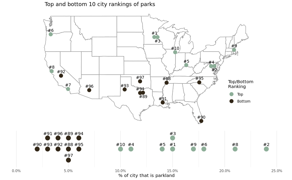
In order to answer this question, we created a map of the United States with the top and bottom 10 ranked cities’ parks alongside the distribution of percentage of their parkland to get a sense of both the geographic distribution of the top and bottom 10 cities, but also how the top and bottom deciles and geographic regions vary by percentage of city that is parkland. A map was the obvious choice for this analysis at it is the most intuitive way to visualize spatial data in a manner familiar to most audiences.
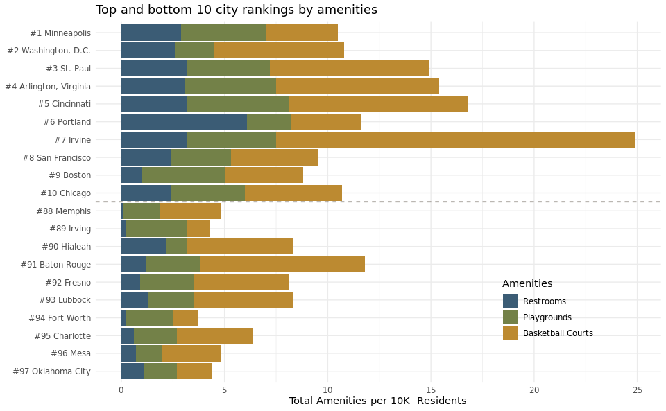
We also created a visualization of 3 key amenities within these top and bottom 10 city parks (basketball courts, playgrounds, and restrooms) in the form of a stacked bar plot measuring the differences in the total number of these amenities per 10k residents in each of the 20 cities. By doing so, we were able to compare the relative quantity and type of amenities between the top and bottom ten cities to see how this affects their rank. A stacked bar plot was the best candidate for this part of the question because we wanted to display a large quantity of cities (20), but also be able to split them by the types of amenities without overwheling the audience.
Analysis
### data wrangling

#top/bottom 10 cities
parks_2020 <- parks %>%
  filter(year == 2020,
         rank <= 10 | rank >= 88)

#matching cities dataframe with parks dataframe
cities <- cities %>%
  filter(state != "Maine") %>%
  mutate(city = case_when(city == "Washington" ~ "Washington, D.C.",
                          city == "Charlotte" ~ "Charlotte/Mecklenburg County",
                          TRUE ~ city)) %>%
  select(city, latitude, longitude) %>%
  rbind(tibble(city = c("Arlington, Virginia"),
               latitude = c(38.8816),
               longitude = c(-77.0910)))

#merging cities and parks data frames
parks_2020_coords <- left_join(parks_2020, cities, by = "city")

#creating an indicator variable for rank
parks_2020_coords <- parks_2020_coords %>%
  mutate(rank_div = ifelse(rank <= 10, "Top", "Bottom"))

parks_2020_coords$rank_div <- factor(parks_2020_coords$rank_div, levels = c(
  "Top", "Bottom"))

#dodging overlapping points
parks_2020_coords <- parks_2020_coords %>%
  mutate(longitude = case_when(rank == 1 ~ -93.5,
                               rank == 3 ~ -92.6,
                               rank == 2 ~ -76.6,
                               rank == 4 ~ -77.5,
                               rank == 89 ~ -96.7,
                               rank == 94 ~ -97.5,
                               TRUE ~ longitude),
         updown = ifelse(rank %in% c(3, 89, 2), "down", "up"),
         y_height = case_when(rank == 3 ~ 1,
                              rank == 91 ~ 1,
                              rank == 96 ~ 1,
                              rank == 89 ~ 1,
                              rank == 97 ~ -1,
                              rank == 94 ~ 1,
                              TRUE ~ 0))

### plot of top/bottom 10 cities scaled by % of parkland

map_plot <- ggplot() +
  geom_polygon(data = map_data("state"), aes(x = long, y = lat, group = group),
               fill = "white", color = "gray60") +
  geom_point(data = parks_2020_coords,
             aes(x = longitude, y = latitude, color = rank_div), size = 4) +
  geom_text(data = parks_2020_coords %>% filter(updown == "up"),
            aes(x = longitude, y = latitude, label = paste0("#",rank)),
            size = 3.5, vjust = -.8, family = "bold") +
  geom_text(data = parks_2020_coords %>% filter(updown == "down"),
            aes(x = longitude, y = latitude, label = paste0("#",rank)),
            size = 3.5, vjust = 1.8, family = "bold") +
  scale_color_manual(values = c("#8dae98", "#322718")) +
  labs(x = NULL, y = NULL, color = "Top/Bottom\nRanking",
       title = "Top and bottom 10 city rankings of parks") +
  coord_map() +
  theme_void() +
  theme(legend.position = c(.92,.3),
        plot.title = element_text(hjust = 0.1),
        plot.subtitle = element_text(hjust = 0.1))

line_plot <- ggplot(parks_2020_coords, aes(x = as.numeric(str_extract(park_pct_city_data, "\\d+"))/100,
                              y = y_height, color = rank_div)) +
  geom_point(size = 5, show.legend = FALSE) +
  geom_text(aes(label = paste0("#",rank)), color = "black", vjust = -1) +
  scale_color_manual(values = c("#8dae98", "#322718")) +
  ylim(-1.5, 1.5) +
  scale_x_continuous(labels = scales::percent, limits = c(0, .25)) +
  labs(x = "% of city that is parkland") +
  theme_minimal() +
  theme(axis.ticks.y = element_blank(), axis.text.y = element_blank(),
        panel.grid.major.y = element_blank(), panel.grid.minor.y = element_blank(),
        axis.title.y = element_blank())

grid.arrange(map_plot, line_plot, nrow = 2, heights = c(5, 2))
## Warning: Removed 1 rows containing missing values (geom_point).

## Warning: Removed 1 rows containing missing values (geom_text).
# data wrangling

# creating a total amenities variable
parks_2020_coords <- parks_2020_coords %>%
  mutate(total_amenities = playground_data + restroom_data + basketball_data)

# creating a long dataset for amenities, adding rank to city name for plot, and
# shortening long city names
parks_amenities <- parks_2020_coords %>%
  pivot_longer(cols = c(playground_data, restroom_data, basketball_data),
               names_to = "amenity", values_to = "value") %>%
  mutate(city = ifelse(city == "Charlotte/Mecklenburg County", "Charlotte", city),
         city_n = paste0("#", rank, " ", city))

# plot of amenities
ggplot(data = parks_amenities, mapping = aes(y = reorder(city_n, -rank))) +
  geom_bar(stat = "identity", mapping = aes(x = value, fill = amenity)) +
  geom_hline(yintercept = 10.5, linetype = "dashed", color = "#322718") +
  guides(fill = guide_legend(reverse = TRUE)) +
  labs(title = "Top and bottom 10 city rankings by amenities",
       x = "Total Amenities per 10K  Residents", y = NULL, fill = "Amenities") +
  scale_fill_manual(values = c("#bc8a31", "#738148", "#3b5c75"),
                    labels = c("Basketball Courts", "Playgrounds", "Restrooms")) +
  theme_minimal() +
  theme(legend.position = c(0.8,0.2))
Discussion
The United States map visualization illustrates the location of the top 10 and bottom 10 ranked cities. This plot demonstrates that the cities ranked 1-10 have a higher percentage of city land dedicated to parks than the lowest-ranked cities in the dataset. This conclusion is in line with our initial hypothesis. We expected cities with a high overall score, calculated by the number of amenities per 10k residents, median park size, spending per resident, etc., to also have more city land dedicated to public parks. The geographic distribution of the 20 cities we plotted also provided interesting observations. The 10 cities with the lowest scores were all in the South and Southeast regions of the United States. The top 10 cities in 2020 are all in the Northeast, Midwest, and the state of California. We assume that this might imply that local governments in these regions and state are more invested in creating higher-quality parks for their residents. Another possibility is that the Northeast, Midwest, and California cities have a wealthier tax base and can invest more tax-payer money into public parks.
The stacked bar plot highlights three critical amenities for the top 10 and bottom 10 cities in 2020. In general, total amenities per 10K residents are higher in the top 10 cities than in the bottom 10 cities. This observation aligns with our prior assumptions because logically, higher-quality public parks will have more amenities, particularly restrooms, playgrounds, and basketball courts. This trend also correlates with our conclusion from the United States map visualization because the top 10 cities have a higher percentage of parkland and more amenities per 10K residents.
The number of restrooms provided a striking observation because the number of restrooms per 10,000 residents for the top 10 ranked cities is significantly higher than those in the bottom 10 cities. This makes sense, because higher quality parks should have more restrooms. Additionally, the top 10 cities have more playgrounds and basketball courts per resident, which makes sense because the number of ameneties is a factor in determining rank. The sheer number of basketball courts per 10K residents in Irvine is visually impressive. The three amenities selected for this plot (restrooms, playground, and basketball courts) represent three commonly used park amenities. This plot highlights the difference among these 20 cities in terms of monetary investment in amenity-filled public city parks.
Presentation
Our presentation can be found here and the code can be found here.
Data
Jones, R 2015, 1000 Largest US Cities By Population With Geographic Coordinates, in JSON, electronic dataset, GitHub Gist, viewed 24 September 2021, http://www.https://gist.github.com/Miserlou/c5cd8364bf9b2420bb29.
The Trust for Public Land 2020, 2020 Park Score Index, electronic dataset, GitHub, viewed 23 September 2021, https://raw.githubusercontent.com/rfordatascience/tidytuesday/master/data/2021/2021-06-22/parks.csv.
References
- https://www.tpl.org/parks-and-an-equitable-recovery-parkscore-report
- https://github.com/thomasp85/gganimate/wiki/Animation-Composition
- https://cran.r-project.org/web/packages/gganimate/gganimate.pdf
- https://gganimate.com/
- https://www.datanovia.com/en/blog/gganimate-how-to-create-plots-with-beautiful-animation-in-r/
- http://r-statistics.co/Top50-Ggplot2-Visualizations-MasterList-R-Code.html
- https://ropensci.org/blog/2018/07/23/gifski-release/
- https://gif.ski/
- https://github.com/r-rust/gifski
- https://gganimate.com/articles/gganimate.html#rendering-1
- https://stackoverflow.com/questions/52899017/slow-down-gganimate-in-r
- https://www.nationalgeographic.org/maps/united-states-regions/
- https://colorpalette.org/nature-wilderness-vegetation-color-palette-4/