Beyond the Rings: Analyzing Olympic Athlete and Medal-Winning Country Characteristics ================ by Mr. Palmer’s Penguins
Introduction
The set, which includes 15 variables and 271116 observations, provides insight into the athletes that competed in and the results of the Olympic games from Athens 1896 to Rio 2016. Each observation includes information about an athlete on a per event basis. Therefore, if an athlete competes in multiple different events, there will be multiple different observations reflecting each event an individual participated in. Each observation details medal results (Gold, Silver, Bronze, or NA), the athlete’s background (age, sex, height, weight, team they’re competing for, etc.), and context about the event (where and when it was held, season, sport the athlete competes in, etc.). We chose this dataset because we think it can provide a lot of good insights into some of the trends at the Olympics over the past century.
This dataset was accessed on kaggle.com and includes data scraped in May 2018 from Sports Reference/OlympStats, sports statistics sites, by Randi Griffin, a Senior Data Scientist at Boston Consulting Group. Moreover, it was selected as part of the TidyTuesday challenge on 7/27/21.
Understanding Physical Characteristics of Olympians
Introduction
For this section, we hope to answer the question: do certain physical
characteristics (such as body mass index with height and weight,
age, and sex) of Olympic participants differ by sport and/or
change with time (year)?
The Olympic Games are a unique opportunity for diverse and talented
individuals to showcase their skills across a variety of disciplines. As
a result, we are interested in better understanding how the diversity of
physical characteristics in the set of competing athletes potentially
differs by sport and/or has changed with time. Three physical
characteristics of interest are body mass index (a factor that takes
height and weight into account), sex, and age. It’s often the
case that the media/press discuss these physical characteristics as key
metrics when describing athletes. Therefore, we are curious about better
understanding the extent to which these differ (if at all).
Firstly, we are hoping to understand if the optimal build of an Olympic
athlete differs by sex and/or by sport. For example, we suspect that
a high performing male Olympic wrestler is more likely to have a
different build than a typical female gymnast. Therefore, we hypothesize
that there may be different optimal heights and weights for successful
athletes of different sexes and depending on the sport.
Secondly, we will assess if the mean age of Olympic participants has
changed over time for each sex. In the 2020 Olympics, there was a lot
of media attention on younger Olympians. Therefore, we are curious how
the mean age of participants has changed over time. With age being a
key physical characteristic, we think this will add another key
dimension to gaining a better understanding of the athletes
participating.
Approach
For our first plot, we plan to use boxplots to plot the distribution of
a size characteristic by sex (since characteristics tend to differ
among males and females) and faceting by sport. We are unsure which of
the height, weight, height / weight, or body mass index ratio (a
measure that integrates height and weight into a single
metric) will be most
telling when examined across sexes and sports. We will start by making 4
plots (each with one of these on the y-axis) and then select the plot
where the trends are most insightful. Based on the results from these
preliminary plots, in addition to narrowing in on a size characteristic,
we might pick a few select sports to focus in on (i.e. most popular
sports) or group the sports based on common characteristics (ex: contact
vs. non-contact, etc.) since there are 66 sports in the dataset. We
think a boxplot makes the most sense because they not only make it is
easy to visualize distributions across a range of divisions but they
also best control for outliers. Boxplots add outliers as points which is
a better approach than ridge lines and violins which look relatively
flat with a wide spread distribution.
For our second plot, we are going to make a scatter plot of average
age vs. year color mapped by sex. To start, we will find the
average age of the participants by sex for each year. This will allow us
to make a scatter plot with only two observations (one for Male and one
for Female) for each year. We choose a scatter plot because we believe
it can best represent the relationship and highlight potential trends.
We considered a line plot but ultimately decided that the discreteness
of each of the points (rather than them being connected) would better
allow us to compare observations year by year. Since there is unique
context that surrounds each Olympics game, we feel as though a more
year-specific (point based) approach could be more meaningful.
Analysis
In order to plot using BMI, we must first create the variable and select our font:
# Create new calculated variables to represent physical build
olympics <- olympics %>%
  mutate(
    height_weight_ratio = height / weight,
    BMI = 10000 * weight / (height * height)
  )

# load Olympic font
font_add_google(name = "Oswald")
showtext_auto()
After examining each of height, weight, height_weight_ratio, and
BMI, we have chosen to proceed with BMI as our size characteristic
for this plot, as the visualizations were the most accessible and
intuitive to interpret. After examining the plot displaying the BMI
for all sports, we are choosing a few select groups of sports to include
based on common characteristics of each of them. The next step is to
create separate dataframes for each of these categories. We also want to
represent each athlete once on the plot, so we will have to use
distinct().
# create variable to represent category of sport
# keep only one observation per athlete
olympics <- olympics %>%
  distinct(id, .keep_all = TRUE) %>%
  mutate(sex = factor(sex, labels = c("Female", "Male"))) %>%
  filter(sport %in% c("Boxing", "Judo", "Weightlifting", "Wrestling", "Gymnastics", "Trampolining", "Archery", "Shooting", "Athletics", "Rowing")) %>%
  mutate(
    category = case_when(
      sport %in% c("Boxing", "Judo", "Weightlifting", "Wrestling") ~ "weightclass",
      sport %in% c("Gymnastics", "Trampolining") ~ "acrobatic",
      sport %in% c("Archery", "Shooting") ~ "coordination",
      TRUE ~ "diverse"
    ),
    category = factor(category, levels = c("acrobatic", "diverse", "coordination", "weightclass"))
  )

# create separate dataframes for each of these categories
olympics_weightclass <- olympics %>%
  filter(category == "weightclass")

olympics_coordination <- olympics %>%
  filter(category == "coordination")

olympics_diverse <- olympics %>%
  filter(category == "diverse")

olympics_acrobatic <- olympics %>%
  filter(category == "acrobatic")
We are now ready to create a separate plot for each sport category. We will also silence messages which indicate that rows with NA have been dropped from the dataframe when creating the boxplots.
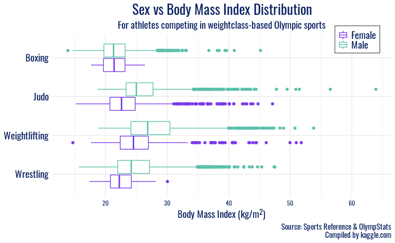
ggplot(olympics_weightclass, mapping = aes(y = fct_rev(sport), x = BMI, color = sex)) +
  geom_boxplot(position = position_dodge2(10)) +
  labs(
    x = "Body Mass Index (kg/m<sup>2</sup>)",
    y = NULL,
    color = "Sex",
    title = "Sex vs Body Mass Index Distribution",
    subtitle = "For athletes competing in weightclass-based Olympic sports", ,
    caption = "Source: Sports Reference & OlympStats\nCompiled by kaggle.com"
  ) +
  scale_color_manual(values = c("#7B38EC", "#5CC0AB")) +
  facet_grid(category ~ ., scales = "free_y", space = "free") +
  theme_minimal() +
  theme(
    strip.background = element_blank(),
    strip.text.y = element_blank(),
    panel.spacing.y = unit(0.4, "cm"),
    plot.title = element_text(family = "Oswald", color = "#092260", size = 20, hjust = 0.5),
    plot.caption = element_text(family = "Oswald", color = "#092260", size = 11),
    plot.subtitle = element_text(family = "Oswald", color = "#092260", size = 14, hjust = 0.5),
    axis.text.x = element_text(family = "Oswald", color = "#092260"),
    axis.title.x = element_markdown(family = "Oswald", color = "#092260", size = 14),
    axis.text.y = element_text(family = "Oswald", color = "#092260", size = 14),
    legend.text = element_text(family = "Oswald", color = "#092260", size = 14),
    legend.title = element_blank(),
    legend.position = c(0.9, 0.97),
    legend.background = element_rect(size = 0.3),
    legend.margin = margin(1, 5, 5, 5),
    legend.key.size = unit(0.5, "cm")
  )
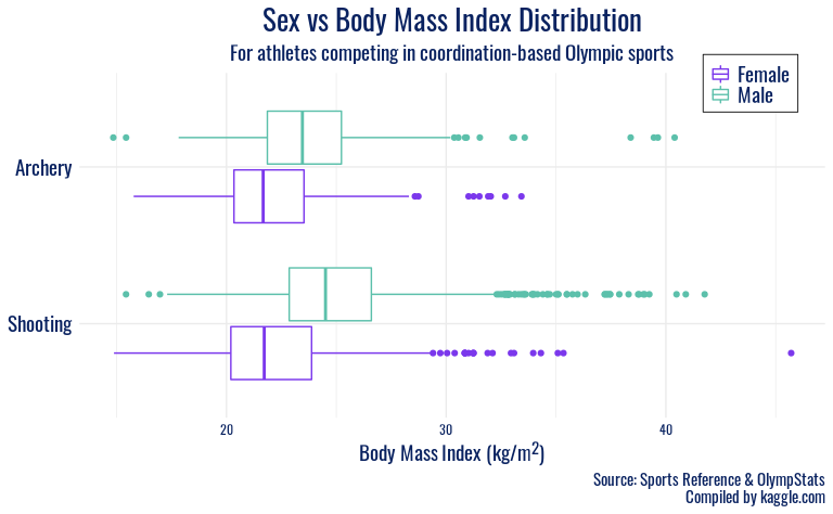
ggplot(olympics_coordination, mapping = aes(y = fct_rev(sport), x = BMI, color = sex)) +
  geom_boxplot(position = position_dodge2(10)) +
  labs(
    x = "Body Mass Index (kg/m<sup>2</sup>)",
    y = NULL,
    color = "Sex",
    title = "Sex vs Body Mass Index Distribution",
    subtitle = "For athletes competing in coordination-based Olympic sports", ,
    caption = "Source: Sports Reference & OlympStats\nCompiled by kaggle.com"
  ) +
  scale_color_manual(values = c("#7B38EC", "#5CC0AB")) +
  facet_grid(category ~ ., scales = "free_y", space = "free") +
  theme_minimal() +
  theme(
    strip.background = element_blank(),
    strip.text.y = element_blank(),
    panel.spacing.y = unit(0.4, "cm"),
    plot.title = element_text(family = "Oswald", color = "#092260", size = 20, hjust = 0.5),
    plot.caption = element_text(family = "Oswald", color = "#092260", size = 11),
    plot.subtitle = element_text(family = "Oswald", color = "#092260", size = 14, hjust = 0.5),
    axis.text.x = element_text(family = "Oswald", color = "#092260"),
    axis.title.x = element_markdown(family = "Oswald", color = "#092260", size = 14),
    axis.text.y = element_text(family = "Oswald", color = "#092260", size = 14),
    legend.text = element_text(family = "Oswald", color = "#092260", size = 14),
    legend.title = element_blank(),
    legend.position = c(0.9, 0.97),
    legend.background = element_rect(size = 0.3),
    legend.margin = margin(1, 5, 5, 5),
    legend.key.size = unit(0.5, "cm")
  )
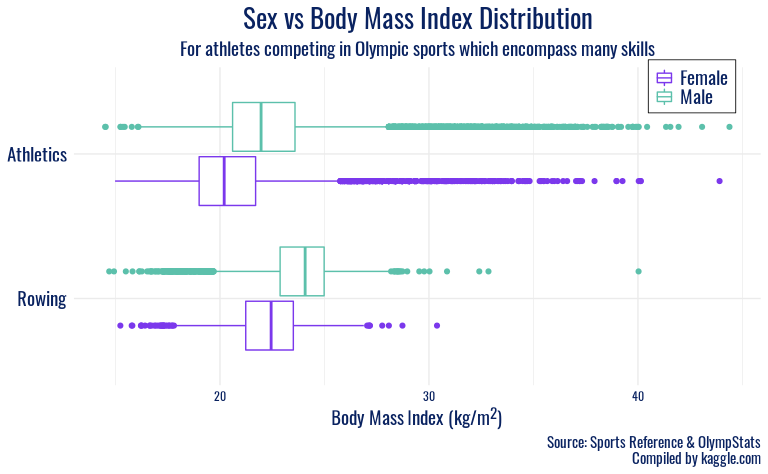
ggplot(olympics_diverse, mapping = aes(y = fct_rev(sport), x = BMI, color = sex)) +
  geom_boxplot(position = position_dodge2(10)) +
  labs(
    x = "Body Mass Index (kg/m<sup>2</sup>)",
    y = NULL,
    color = "Sex",
    title = "Sex vs Body Mass Index Distribution",
    subtitle = "For athletes competing in Olympic sports which encompass many skills", ,
    caption = "Source: Sports Reference & OlympStats\nCompiled by kaggle.com"
  ) +
  scale_color_manual(values = c("#7B38EC", "#5CC0AB")) +
  facet_grid(category ~ ., scales = "free_y", space = "free") +
  theme_minimal() +
  theme(
    strip.background = element_blank(),
    strip.text.y = element_blank(),
    panel.spacing.y = unit(0.4, "cm"),
    plot.title = element_text(family = "Oswald", color = "#092260", size = 20, hjust = 0.5),
    plot.caption = element_text(family = "Oswald", color = "#092260", size = 11),
    plot.subtitle = element_text(family = "Oswald", color = "#092260", size = 14, hjust = 0.5),
    axis.text.x = element_text(family = "Oswald", color = "#092260"),
    axis.title.x = element_markdown(family = "Oswald", color = "#092260", size = 14),
    axis.text.y = element_text(family = "Oswald", color = "#092260", size = 14),
    legend.text = element_text(family = "Oswald", color = "#092260", size = 14),
    legend.title = element_blank(),
    legend.position = c(0.9, 0.94),
    legend.background = element_rect(size = 0.3),
    legend.margin = margin(1, 5, 5, 5),
    legend.key.size = unit(0.5, "cm")
  )
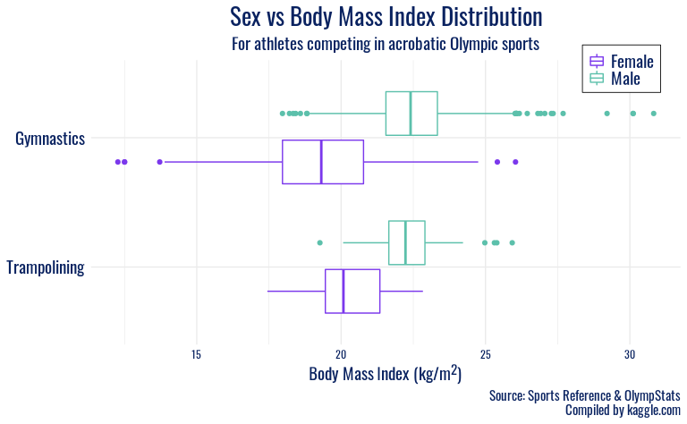
ggplot(olympics_acrobatic, mapping = aes(y = fct_rev(sport), x = BMI, color = sex)) +
  geom_boxplot(position = position_dodge2(10)) +
  labs(
    x = "Body Mass Index (kg/m<sup>2</sup>)",
    y = NULL,
    color = "Sex",
    title = "Sex vs Body Mass Index Distribution",
    subtitle = "For athletes competing in acrobatic Olympic sports", ,
    caption = "Source: Sports Reference & OlympStats\nCompiled by kaggle.com"
  ) +
  scale_color_manual(values = c("#7B38EC", "#5CC0AB")) +
  facet_grid(category ~ ., scales = "free_y", space = "free") +
  theme_minimal() +
  theme(
    strip.background = element_blank(),
    strip.text.y = element_blank(),
    panel.spacing.y = unit(0.4, "cm"),
    plot.title = element_text(family = "Oswald", color = "#092260", size = 20, hjust = 0.5),
    plot.caption = element_text(family = "Oswald", color = "#092260", size = 11),
    plot.subtitle = element_text(family = "Oswald", color = "#092260", size = 14, hjust = 0.5),
    axis.text.x = element_text(family = "Oswald", color = "#092260"),
    axis.title.x = element_markdown(family = "Oswald", color = "#092260", size = 14),
    axis.text.y = element_text(family = "Oswald", color = "#092260", size = 14),
    legend.text = element_text(family = "Oswald", color = "#092260", size = 14),
    legend.title = element_blank(),
    legend.position = c(0.9, 0.97),
    legend.background = element_rect(size = 0.3),
    legend.margin = margin(1, 5, 5, 5),
    legend.key.size = unit(0.5, "cm")
  )
We found a citation for the Tokyo 2020 Olympics logo font here and were pointed to an open-source alternative here. We got the hex code used in plot text manually from that logo source. We chose the hex codes for our favorite gender color mapping from Telegraph 2018 here.
We can now visualize these groups on the same plot, to get a better sense of broader variability in size characteristics among an array of Olympic sports.
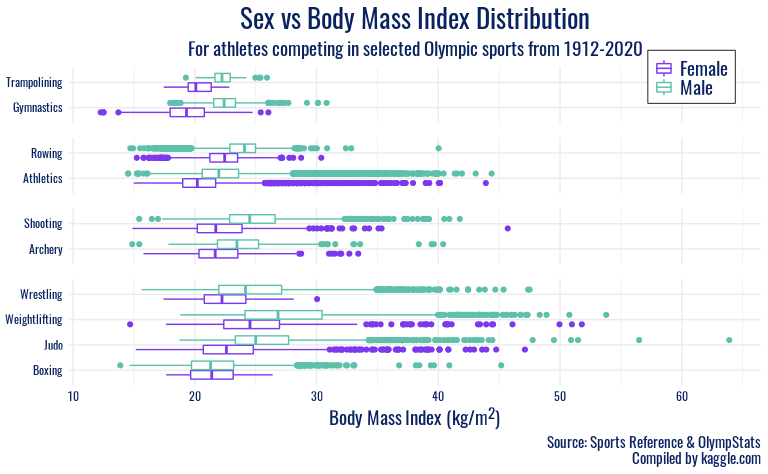
ggplot(olympics, mapping = aes(y = sport, x = BMI, color = sex)) +
  geom_boxplot(position = position_dodge2(10)) +
  labs(
    x = "Body Mass Index (kg/m<sup>2</sup>)",
    y = NULL,
    color = "Sex",
    title = "Sex vs Body Mass Index Distribution",
    subtitle = "For athletes competing in selected Olympic sports from 1912-2020", ,
    caption = "Source: Sports Reference & OlympStats\nCompiled by kaggle.com"
  ) +
  scale_color_manual(values = c("#7B38EC", "#5CC0AB")) +
  facet_grid(category ~ ., scales = "free_y", space = "free") +
  theme_minimal() +
  theme(
    strip.background = element_blank(),
    strip.text.y = element_blank(),
    panel.spacing.y = unit(0.4, "cm"),
    plot.title = element_text(family = "Oswald", color = "#092260", size = 20, hjust = 0.5),
    plot.caption = element_text(family = "Oswald", color = "#092260", size = 11),
    plot.subtitle = element_text(family = "Oswald", color = "#092260", size = 14, hjust = 0.5),
    axis.text.x = element_text(family = "Oswald", color = "#092260"),
    axis.title.x = element_markdown(family = "Oswald", color = "#092260", size = 14),
    axis.text.y = element_text(family = "Oswald", color = "#092260"),
    legend.text = element_text(family = "Oswald", color = "#092260", size = 14),
    legend.title = element_blank(),
    legend.position = c(0.9, 0.97),
    legend.background = element_rect(size = 0.3),
    legend.margin = margin(1, 5, 5, 5),
    legend.key.size = unit(0.5, "cm")
  )
For our second plot, we will look at how age of Olympic participants
by sex has changed with time.
We will re-load the CSV file to clear any manipulations done on the Olympics data frame to make the first plot.
Since the observations in the data are done on a per event competed in
basis (rather than a per athlete basis), we will use distinct() to
filter the data so we only have unique athletes represented each year.
In other words, each year will contain a set of observations
representing one athlete each. This will remove cases where the age of
an athlete who competed in multiple events for a given Olympics is
repeated multiple times.
# keep only one observation per athlete
olympics <- olympics %>%
  distinct(id, year, .keep_all = TRUE) %>%
  mutate(sex = factor(sex, labels = c("Female", "Male")))
Finally, we will make the plot showing the average yearly age of
athletes by sex. We will drop observations in which the age is
unknown.
olympics %>%
  drop_na(age) %>%
  group_by(year, sex) %>%
  dplyr::summarise(avg_age = mean(age), .groups = "drop_last") %>%
  arrange(desc(sex)) %>%
  ggplot(mapping = aes(y = avg_age, x = year)) +
  geom_point(aes(color = sex)) +
  labs(
    x = "Year",
    y = "Age",
    color = "Sex",
    title = "Average Yearly Age of Athletes By Sex",
    subtitle = "For athletes competing in selected Olympic sports from 1912-2020",
    caption = "Source: Sports Reference & OlympStats\nCompiled by kaggle.com"
  ) +
  scale_color_manual(values = c("#7B38EC", "#5CC0AB"), guide = guide_legend(reverse = TRUE)) +
  theme_minimal() +
  theme(
    strip.background = element_blank(),
    strip.text.y = element_blank(),
    panel.spacing.y = unit(0.4, "cm"),
    plot.title = element_text(family = "Oswald", color = "#092260", size = 20, hjust = 0.5),
    plot.caption = element_text(family = "Oswald", color = "#092260", size = 11),
    plot.subtitle = element_text(family = "Oswald", color = "#092260", size = 14, hjust = 0.5),
    axis.text.x = element_text(family = "Oswald", color = "#092260"),
    axis.title.x = element_text(family = "Oswald", color = "#092260", size = 14),
    axis.title.y = element_text(family = "Oswald", color = "#092260", size = 14),
    axis.text.y = element_text(family = "Oswald", color = "#092260"),
    legend.text = element_text(family = "Oswald", color = "#092260", size = 14),
    legend.title = element_blank(),
    legend.position = c(0.8, 0.68),
    legend.background = element_rect(size = 0.3),
    legend.margin = margin(1, 5, 5, 5),
    legend.key.size = unit(0.5, "cm")
  )
The mean was used, rather than the median, of age as this better
captures the range of ages of athletes for a given year.
Discussion
In the “Sex vs Body Mass Index Distribution” plots, men typically have a
higher-centered distribution of BMI than women in the same sport, but
other trends are more apparent by category. In the first plot, which
includes wrestling, weightlifting, judo, and boxing, we see a strong
right skew in most distributions. We interpret this as a reflection of
the weight classes present in those sports, with many participants
entering in lower weight classes, giving a lower center, but a
non-trivial number of athletes with BMIs higher than 30. However, there
are fewer at these high BMIs, possibly due to the difficulty in
maintaining athletic competitiveness at that proportion. Shooting and
archery also have generally higher BMIs than other sports, and again a
right-skew is observed in the distributions. This reflects those sports’
focus on hand-eye coordination, and thus athlete body type or height or
weight are more variable.
The next group of sports, Athletics and Rowing, feature distributions
with large variability on both sides. We interpret this as illustrating
the diversity of body types considered desirable in this sports: from
slender, lithe coxswains and sprinters to heavier, more powerful rowers
and throwers. Finally, the largest disparities between sex in a
particular sport are observed in Gymnastics and Trampoline. Here, we
speculate that the female gymnastics disciplines favor petite, nimble
athletes, as opposed to the more upper-body strength oriented male
apparatuses, which contribute to a higher average BMI for male Olympic
gymnasts.
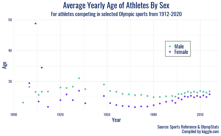
Finally, for the “Average Yearly Age of Athletes By Sex” plot, it was
found that the mean age of athletes by sex has changed pretty
significantly over the years. For instance, the range of mean ages
participating has converged pretty dramatically. Prior to the 1970s, the
mean ages fluctuated in the 20-30 years old range with even some
outliers hitting 35 and 50 years old in some cases. However, since the
1970s, it appears that the mean ages have remained steady in the 25-27
years old range. This makes sense because, according to a Britannica
article found here,
the 1970s were a turning point for the games moving from allowing
professional athletes to compete rather than just amateurs. The article
also notes that it wasn’t until the 1980s that fully-fledged
professional participation was permitted. With this information, we can
speculate that there might be an association between the allowing of
professional athletes and the convergence of mean ages. Perhaps since
most professional athletes are around 25 years old (a point of peak
physical ability for many), the mean age reflects the demographic shift
(amateur to professional) of participants.
In addition to age converging, it is interesting to note the difference between Males and Females. For all years but 3, the mean age of males was higher than females. Perhaps since males take longer to physically mature (puberty is at a later age as described here), that could explain why their ability to compete at “peak perform” in a professional context is at a later age. Moreover, it’s possible that the extreme variability between mean ages of females prior to 1950 is the result of fewer females competing. With fewer competitors, it’s more likely that outlier events (extremely old participants) can skew the mean. For example, prior to 1920, there were 210 female participants versus 9,790 male participants as depicted below. This is a major limitation for this plot.
olympics %>%
  filter(year <= 1920) %>%
  dplyr::count(sex)
## # A tibble: 2 × 2
##   sex        n
##   <fct>  <int>
## 1 Female   210
## 2 Male    9790
These numbers are the total number of unique participants participating in each Olympics game prior to 1920.
Examining Medal-Winning Countries
Introduction
The Olympics are a historic sports event that have been run for over a 125 years. To really grasp the full story of success at the Olympics, we want to take a broader view and look at which countries have been most successful throughout all the Olympic games and in which sports. Nations take pride in their overall medal counts–in modern times, Google tracks and publishes these medal counts. Despite popular interest in these metrics, fewer people are aware of their nations’ performance extending back over a century. Thus, we are intrigued by these cumulative wins and how countries have earned them in the long view.
We also hypothesize that an association exists between a country’s Olympic success and its economic output because of the investment often required to adequately train in many sports. Testing this theory, that economic power corresponds to greater success at the Olympics, will help us understand the relationship between national resources and overall athletes’ success. A nation’s resources can serve as both a boon and a challenge to its athletes. For example, American wealth helps train some of the best gymnasts in the world, but it also supports corruption and abuse in the organization that is USA Gymnastics. To investigate this, we will merge in external data from the Maddison Project Database, a compilation of researchers’ work estimating economic growth for individual countries (Bolt and van Zanden, 2020).
We will be using a variable we create, total_winners, to visualize
total Olympic success for different countries. This variable represents
the number of medals won by each country in each Olympics. We will then
zoom in and look at one specific country’s success, using the sport,
noc, and year variables along with total_winners. For the second
plot, we will load in external historical GDP per capita data and use
this external data along with total_winners to visualize the
relationship between a country’s wins and its economic indicators.
Thus, the question we will examine is the following: which countries are most successful at the games and is this success potentially influenced by high performance in particular sports and/or by the economic status of a country (as measured by GDP)?
Approach
In our first visualization, we will create a bar chart to represent the winningest countries in the history of the Olympics. Country codes will be on the x-axis and total medal count, a new variable we will create, will be on the y-axis. To avoid having an extremely left skewed bar chart with many countries who have won very few medals, we will represent the top 10 winningest countries of all time on our bar chart. This plot will help us gauge the amount of medals the top ten most winningest countries have won, and how they compare to each other. After creating this plot, we will select one country of interest and examine which sports have contributed most heavily to this country’s success. We will then plot out the results of these sports over time to see how their contribution to this country’s medal count may have changed over the years.
For our second visualization, we will create a scatter plot with
gdp_per_capita on the x axis and medals_total on the y axis,
faceting and animating by year. We plan to highlight interesting
outliers with their country names, and we will visualize the winter and
summer Olympics separately because of the different natures of these
events (for example, because overall medal counts are much higher in the
summer games than the winter games). Although we plan to look at data
over time, a faceted or animated scatter plot will preserve all the
information in our data (importantly our two numeric variables,
gdp_per_capita and medals_total), where a line graph would not. We
will use a text layer to annotate outliers, but a plot made of entirely
geom_text() would overwhelm the reader. Also, to maintain granularity,
since individual country identities are important to us, a scatter plot
will serve us better than a sole model or smooth line.
Analysis
# reload the Olympic dataset and also the full country names into the noc_regions object
olympics <- read_csv(file = paste0(here::here(), "/data/olympics_data.csv"), show_col_types = FALSE)
noc_regions <- read_csv(file = paste0(here::here(), "/data/noc_regions.csv"), show_col_types = FALSE)

# make appropriate date for chronological plotting and convert characters in medal wins to numeric values
olympics %<>%
  mutate(
    date = ifelse(season == "Winter", paste0(year, "-02-01"), paste0(year, "-07-01")),
    date = ymd(date),
    medal_winner = ifelse(is.na(medal), 0, 1),
    medal_score = case_when(
      medal == "Bronze" ~ 1,
      medal == "Silver" ~ 2,
      medal == "Gold" ~ 3,
      TRUE ~ 0
    )
  )

noc_regions %<>%
  janitor::clean_names() %>%
  # fix typo
  mutate(region = ifelse(region == "Boliva", "Bolivia", region))

olympics <- left_join(olympics, noc_regions, by = "noc")

olympics_filter <- olympics %>%
  filter(season == "Summer") %>%
  group_by(region) %>%
  dplyr::summarise(total_winners = sum(medal_winner), total_score = sum(medal_score)) %>%
  filter(total_winners >= 910)
The data wrangling step above involves adding the month and day to the
dates of our summer and winter olympic data to help us plot it as time
series data, should we need to do this. We then clean the noc_regions
data.
We have now filtered the data to be used in our first visualization for only Summer Olympic success, as different countries may be successful in different seasons. Given the limitations of the scope of analysis for this project, we will only look at the summer Olympics for this visualization as we feel it is more meaningful than combining both the summer and winter medal counts.
ggplot(olympics_filter, aes(x = reorder(region, total_winners), y = total_winners)) +
  geom_bar(stat = "identity", fill = "#5CC0AB") +
  labs(x = "Country",
       y = "Medal Count",
       title = "All-time Summer Olympic Medal Counts",
       subtitle = "For the top 10 most winningest countries in history",
       caption = "Source: Sports Reference & OlympStats\nCompiled by kaggle.com") +
  theme_minimal() +
  theme(strip.background = element_blank(),
        strip.text.y = element_blank(),
        panel.spacing.y = unit(0.4, "cm"),
        plot.title = element_text(family = "Oswald", color = "#092260", size = 20, hjust = 0.5),
        plot.caption = element_text(family = "Oswald", color = "#092260", size = 11),
        plot.subtitle = element_text(family = "Oswald", color = "#092260", size = 14, hjust = 0.5),
        axis.text.x = element_text(family = "Oswald", color = "#092260"),
        axis.title.x = element_markdown(family = "Oswald", color = "#092260", size = 14),
        axis.text.y = element_text(family = "Oswald", color = "#092260"),
        axis.title.y = element_markdown(family = "Oswald", color = "#092260", size = 14),
        legend.position = "none")
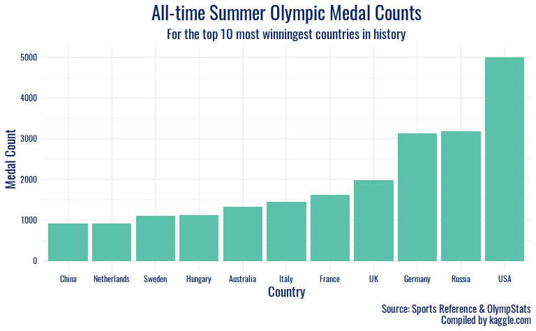 Here is our first plot, which represents the 10 countries that have won
the most medals in Summer Olympic history.
Here is our first plot, which represents the 10 countries that have won
the most medals in Summer Olympic history.
After taking a closer look at the data used to create the first visualization, we decided to represent the contribution of the USA’s two most successful sports to our medal count at each summer Olympic games over time. We filter by the country code “USA” and by sport and year, filtering for only swimming and athletics.
usa_fil <- olympics %>%
  filter(noc == "USA") %>%
  group_by(sport, year)%>%
  dplyr::summarize(total_winners = sum(medal_winner), total_score = sum(medal_score), .groups = "drop")%>%
  filter(sport %in% c("Swimming", "Athletics"))

ggplot(usa_fil, aes(x = year, y = total_winners, color = sport, group = sport)) +
  geom_line() +
  geom_point() +
  labs(
    x = "Year",
    y = "Medal Count",
    title = "USA Olympic Medals Won in Athletics and Swimming",
    caption = "Source: Sports Reference & OlympStats\nCompiled by kaggle.com"
  ) +
  theme_minimal() +
  scale_color_manual(values = c("#7B38EC", "#5CC0AB")) +
  scale_x_continuous(limits = c(1896, 2016), breaks = seq(1896, 2016, by = 8)) +
  theme(
    strip.background = element_blank(),
    strip.text.y = element_blank(),
    panel.spacing.y = unit(0.4, "cm"),
    plot.title = element_text(family = "Oswald", color = "#092260", size = 20, hjust = 0.5),
    plot.caption = element_text(family = "Oswald", color = "#092260", size = 11),
    plot.subtitle = element_text(family = "Oswald", color = "#092260", size = 14, hjust = 0.5),
    axis.text.x = element_text(family = "Oswald", color = "#092260"),
    axis.title.x = element_markdown(family = "Oswald", color = "#092260", size = 14),
    axis.text.y = element_text(family = "Oswald", color = "#092260"),
    axis.title.y = element_markdown(family = "Oswald", color = "#092260", size = 14),
    legend.text = element_text(family = "Oswald", color = "#092260", size = 14),
    legend.title = element_blank(),
    legend.position = c(0.8, 0.18),
    legend.background = element_rect(size = 0.3),
    legend.margin = margin(1, 5, 5, 5),
    legend.key.size = unit(0.5, "cm")
  )
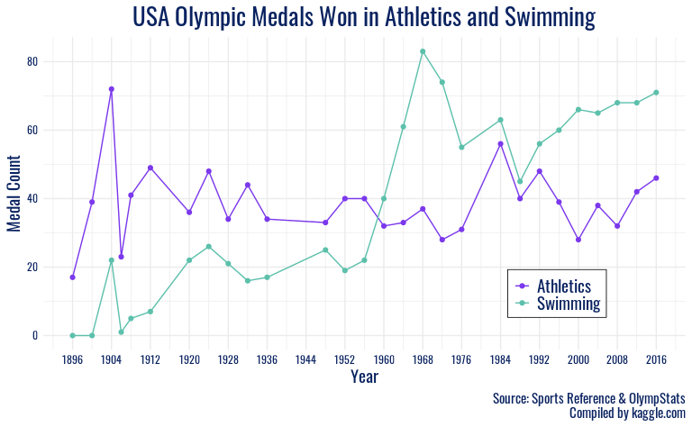
Here we have plotted the number of medals won in Athletics and Swimming at each Summer Olympic games over the years.
Next, we will look at the economic characteristics of these winning countries.
# warnings suppressed due to parsing failures of gdp data which do not affect the data of our concern
detach(package:plyr, unload = TRUE)
gdp <- read_csv("data/gdp-per-capita-maddison-2020.csv", show_col_types = FALSE)

gdp %<>%
  janitor::clean_names() %>%
  mutate(entity = case_when(
    entity == "United States" ~ "USA",
    entity == "United Kingdom" ~ "UK",
    entity == "Congo" ~ "Republic of Congo",
    entity == "Democratic Republic of Congo" ~ "Democratic Republic of the Congo",
    entity == "Cote d'Ivoire" ~ "Ivory Coast",
    entity == "Trinidad and Tobago" ~ "Trinidad",
    entity == "North Macedonia" ~ "Macedonia",
    entity == "Czechia" ~ "Czech Republic",
    TRUE ~ entity
  ))

olympics_gdp <- olympics %>%
  group_by(region, date, season) %>%
  dplyr::summarise(total_winners = sum(medal_winner), total_score = sum(medal_score), .groups = "drop") %>%
  rename(entity = region) %>%
  mutate(
    year = year(date),
    summer_highlight = ifelse(total_winners > 100, T, F),
    winter_highlight = ifelse(total_winners > 30, T, F)
  ) %>%
  left_join(gdp, by = c("entity", "year")) %>%
  rename(country = entity)
We load our historical GDP data and join it to Olympic victory data after cleaning country naming discrepancies between the two.
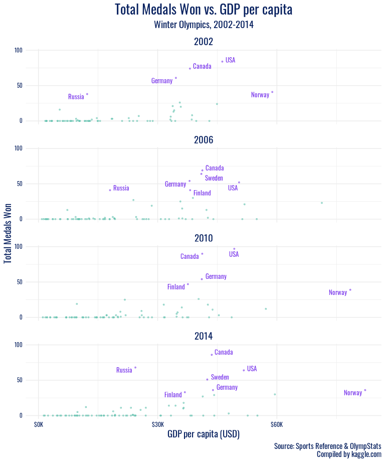
winter_highlight <- olympics_gdp %>%
  filter(!is.na(gdp_per_capita), season == "Winter", year %in% c(2000:2020), total_winners > 30)

olympics_gdp %>%
  filter(!is.na(gdp_per_capita), season == "Winter", year %in% c(2000:2020)) %>%
  ggplot(aes(x = gdp_per_capita, y = total_winners)) +
  geom_point(aes(color = winter_highlight, size = winter_highlight), alpha = .5, size = .75, show.legend = FALSE) +
  geom_text_repel(
    data = winter_highlight, aes(x = gdp_per_capita, y = total_winners, label = country),
    color = "#7B38EC", size = 3.5, family = "Oswald"
  ) +
  facet_wrap(~year, ncol = 1) +
  scale_color_manual(values = c("#5CC0AB", "#7B38EC")) +
  labs(
    title = "Total Medals Won vs. GDP per capita",
    subtitle = "Winter Olympics, 2002-2014",
    y = "Total Medals Won",
    x = "GDP per capita (USD)",
    caption = "Source: Sports Reference & OlympStats\nCompiled by kaggle.com"
  ) +
  scale_y_continuous(breaks = seq(from = 0, to = 100, by = 50)) +
  scale_x_continuous(
    breaks = seq(from = 0, to = 90000, by = 30000),
    labels = label_dollar(scale = .001, prefix = "$", suffix = "K")
  ) +
  theme_minimal() +
  theme(
    strip.background = element_blank(),
    strip.text.y = element_blank(),
    panel.spacing.y = unit(0.4, "cm"),
    legend.title = element_blank(),
    legend.position = c(0.8, 0.68),
    legend.background = element_rect(size = 0.3),
    legend.margin = margin(1, 5, 5, 5),
    legend.key.size = unit(0.5, "cm"),
    plot.title = element_text(family = "Oswald", color = "#092260", size = 20, hjust = 0.5),
    plot.caption = element_text(family = "Oswald", color = "#092260", size = 11),
    strip.text = element_text(family = "Oswald", color = "#092260", size = 14, hjust = 0.5),
    plot.subtitle = element_text(family = "Oswald", color = "#092260", size = 14, hjust = 0.5),
    axis.text.x = element_text(family = "Oswald", color = "#092260"),
    axis.title.x = element_markdown(family = "Oswald", color = "#092260", size = 14),
    axis.text.y = element_text(family = "Oswald", color = "#092260", size = 8),
    axis.title.y = element_text(family = "Oswald", color = "#092260", size = 14),
    legend.text = element_text(family = "Oswald", color = "#092260", size = 14)
  )
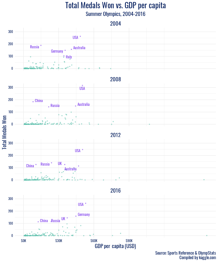
summer_highlight <- olympics_gdp %>%
  filter(!is.na(gdp_per_capita), season == "Summer", year %in% c(2004:2020), total_winners > 100)

olympics_gdp %>%
  filter(!is.na(gdp_per_capita), season == "Summer", year %in% c(2004:2020)) %>%
  ggplot(aes(x = gdp_per_capita, y = total_winners)) +
  geom_point(aes(color = summer_highlight, size = summer_highlight),
    alpha = .5, size = .75, show.legend = FALSE
  ) +
  geom_text_repel(
    data = summer_highlight, aes(x = gdp_per_capita, y = total_winners, label = country),
    color = "#7B38EC", size = 3.5, family = "Oswald"
  ) +
  facet_wrap(~year, ncol = 1) +
  scale_color_manual(values = c("#5CC0AB", "#7B38EC")) +
  labs(
    title = "Total Medals Won vs. GDP per capita",
    subtitle = "Summer Olympics, 2004-2016",
    y = "Total Medals Won",
    x = "GDP per capita (USD)",
    caption = "Source: Sports Reference & OlympStats\nCompiled by kaggle.com"
  ) +
  scale_y_continuous(breaks = seq(from = 0, to = 300, by = 100)) +
  scale_x_continuous(
    breaks = seq(from = 0, to = 90000, by = 30000),
    labels = label_dollar(scale = .001, prefix = "$", suffix = "K")
  ) +
  theme_minimal() +
  theme(
    strip.background = element_blank(),
    strip.text.y = element_blank(),
    panel.spacing.y = unit(0.4, "cm"),
    legend.title = element_blank(),
    legend.position = c(0.8, 0.68),
    legend.background = element_rect(size = 0.3),
    legend.margin = margin(1, 5, 5, 5),
    legend.key.size = unit(0.5, "cm"),
    plot.title = element_text(family = "Oswald", color = "#092260", size = 20, hjust = 0.5),
    plot.caption = element_text(family = "Oswald", color = "#092260", size = 11),
    strip.text = element_text(family = "Oswald", color = "#092260", size = 14, hjust = 0.5),
    plot.subtitle = element_text(family = "Oswald", color = "#092260", size = 14, hjust = 0.5),
    axis.text.x = element_text(family = "Oswald", color = "#092260"),
    axis.title.x = element_markdown(family = "Oswald", color = "#092260", size = 14),
    axis.text.y = element_text(family = "Oswald", color = "#092260", size = 8),
    axis.title.y = element_text(family = "Oswald", color = "#092260", size = 14),
    legend.text = element_text(family = "Oswald", color = "#092260", size = 14)
  )
olympics_gdp %>%
  distinct(country, gdp_per_capita) %>%
  arrange(desc(gdp_per_capita)) %>%
  head(10)
## # A tibble: 10 × 2
##    country              gdp_per_capita
##    <chr>                         <dbl>
##  1 Qatar                       156299
##  2 Qatar                       153922
##  3 Qatar                       107402.
##  4 Norway                       82814
##  5 Norway                       82216
##  6 Norway                       81759
##  7 Kuwait                       78801
##  8 Norway                       78476.
##  9 Norway                       76522.
## 10 United Arab Emirates         75876
olympics_gdp %>%
  filter(!is.na(gdp_per_capita), country != "Qatar", season == "Summer", year %in% c(2004:2020)) %>%
  ggplot(aes(x = gdp_per_capita, y = total_winners)) +
  geom_point(aes(color = summer_highlight, size = summer_highlight),
    alpha = .5, size = .75, show.legend = FALSE
  ) +
  geom_text_repel(
    data = summer_highlight, aes(x = gdp_per_capita, y = total_winners, label = country),
    color = "#7B38EC", size = 3.5, family = "Oswald"
  ) +
  facet_wrap(~year, ncol = 1) +
  scale_color_manual(values = c("#5CC0AB", "#7B38EC")) +
  labs(title = "Total Medals Won vs. GDP per capita",
       subtitle = "Summer Olympics, 2004-2016",
       y = "Total Medals Won",
       x = "GDP per capita (USD)",
       caption = "Source: Sports Reference & OlympStats\nCompiled by kaggle.com") +
  scale_y_continuous(breaks = seq(from = 0, to = 300, by = 100)) +
  scale_x_continuous(
    breaks = seq(from = 0, to = 90000, by = 30000),
    labels = label_dollar(scale = .001, prefix = "$", suffix = "K")
  ) +
  theme_minimal() +
  theme(
    strip.background = element_blank(),
    strip.text.y = element_blank(),
    panel.spacing.y = unit(0.4, "cm"),
    legend.title = element_blank(),
    legend.position = c(0.8, 0.68),
    legend.background = element_rect(size = 0.3),
    legend.margin = margin(1, 5, 5, 5),
    legend.key.size = unit(0.5, "cm"),
    plot.title = element_text(family = "Oswald", color = "#092260", size = 20, hjust = 0.5),
    plot.caption = element_text(family = "Oswald", color = "#092260", size = 11),
    strip.text = element_text(family = "Oswald", color = "#092260", size = 14, hjust = 0.5),
    plot.subtitle = element_text(family = "Oswald", color = "#092260", size = 14, hjust = 0.5),
    axis.text.x = element_text(family = "Oswald", color = "#092260"),
    axis.title.x = element_markdown(family = "Oswald", color = "#092260", size = 14),
    axis.text.y = element_text(family = "Oswald", color = "#092260", size = 8),
    axis.title.y = element_text(family = "Oswald", color = "#092260", size = 14),
    legend.text = element_text(family = "Oswald", color = "#092260", size = 14)
  )
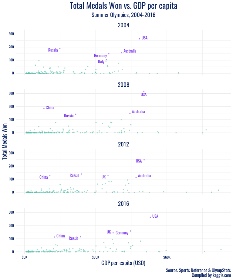
Then we plot GDP per capita against medals won over time in the summer and winter Olympics separately. Qatar, which has a GDP per capita of nearly double the next highest nation, makes it difficult to view trends among remaining countries, so we remove them for a second look at the summer games.
winter_highlight <- olympics_gdp %>%
  filter(!is.na(gdp_per_capita), season == "Winter", year %in% c(1950:2020), total_winners > 30)

winter_gdp <- olympics_gdp %>%
  filter(!is.na(gdp_per_capita), season == "Winter", year %in% c(1950:2020)) %>%
  ggplot(aes(x = gdp_per_capita, y = total_winners)) +
  geom_point(aes(color = winter_highlight), alpha = .5, size = 2, show.legend = FALSE) +
  geom_text(
    data = winter_highlight, aes(x = gdp_per_capita, y = total_winners, label = country),
    color = "#7B38EC", size = 4, family = "Oswald", vjust = 1
  ) +
  scale_color_manual(values = c("#5CC0AB", "#7B38EC")) +
  labs(
    title = "Total Medals Won vs. GDP per capita",
    subtitle = "Winter Olympics, 1950-2020\nYear: {closest_state}",
    y = "Total Medals Won",
    x = "GDP per capita (USD)",
    caption = "Source: Sports Reference & OlympStats\nCompiled by kaggle.com"
  ) +
  scale_x_continuous(
    breaks = seq(from = 0, to = 90000, by = 30000),
    labels = label_dollar(scale = .001, prefix = "$", suffix = "K")
  ) +
  theme_minimal() +
  theme(strip.background = element_blank(),
        strip.text.y = element_blank(),
        panel.spacing.y = unit(0.4, "cm"),
        legend.title = element_blank(),
        legend.position = c(0.8, 0.68),
        legend.background = element_rect(size = 0.3),
        legend.margin = margin(1, 5, 5, 5),
        legend.key.size = unit(0.5, "cm"),
        plot.title = element_text(family = "Oswald", color = "#092260", size = 17, hjust = 0.5),
        plot.caption = element_text(family = "Oswald", color = "#092260", size = 8),
        plot.subtitle = element_text(family = "Oswald", color = "#092260", size = 11, hjust = 0.5),
        axis.text.x = element_text(family = "Oswald", color = "#092260"),
        axis.title.x = element_markdown(family = "Oswald", color = "#092260", size = 11),
        axis.text.y = element_text(family = "Oswald", color = "#092260", size = 7),
        axis.title.y = element_text(family = "Oswald", color = "#092260", size = 11),
        legend.text = element_text(family = "Oswald", color = "#092260", size = 11)) +
  transition_states(year, transition_length = 1, state_length = .3)

animate(winter_gdp, duration = 16, fps = 10, renderer = gifski_renderer())
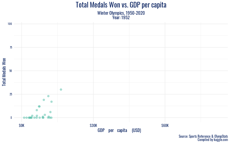
To look at these economic trends over a longer period of time, we animate our winter GDP plot from the 1950s onward.
Discussion
After plotting the 10 most successful summer Olympic countries in history, it is clear that the USA has a wide lead over the USSR, which is in second place, and other countries behind them, including Great Britain, Germany, France, and Italy. The United States, as seen in the visualization, has won over 5,000 summer Olympic medals, while the USSR has won just over 2,000. Britain has earned a similar amount, and we can see a steady decline after that. Because of the wide gap between first and second place, we decided to examine the data to see which sports contributed most to the success of the Americans. After examining the data and grouping the USA’s medals by sport, we found that the two most successful American summer Olympic sports were swimming and athletics.
The immense contribution of swimming and athletics to American summer Olympic success feels intuitive, as these two sports consist of a myriad of events with many medals up for grabs, whereas sports like basketball offer only a few medal opportunities at each summer Olympics. When we examine how the USA accumulated successes in these sports over time, we find that until the 1960 games, the USA won more athletic medals than swimming medals at every occurrence of the summer Olympics. But, starting in 1960, the USA medal count in swimming overtook athletics, and since then, the United States has won more swimming than athletic medals at every Olympic games. The data is missing values for 1940 and 1944 because of World War II and for 1980 because of the worldwide boycott of the Russian Olympic games. We found this observed trend interesting because in the late 20th century, there was a small gap between the number of medals won in swimming and athletics, but starting in 1996 and continuing through the turn of the century, the gap started to widen. This could be because of a multitude of reasons, including more development of Team USA swimming and coaching and more young athletes interested and with entryway into the sport, or the addition of more swimming events. In the last three Olympics for which we have data, we can see that the gap between the two sports stays relatively steady but success in both is on the rise. Perhaps this tells us that countries that are successful in sports with more medals up for grabs tend to see higher total medals for their country. Of course, more visualizations could be done to understand the sports that other countries like Russia do well in or how this varies by season. However, since we are working withing constraints for the length of the project, this will have to remain as a limitation.
In addition to the specific sports a country excels in being potentially related to medal success, our visualizations of economic indicators against Olympic success reveal both an association we expected and some meaningful outliers we did not predict. In the recent winter Olympics (since 2002), all of the countries with over 30 medal wins per games had a GDP per capita of over 30,000 USD, with the exception of Russia. It seems that perhaps Russia’s strong cultural history in winter sports like figure skating, their legacy of coaches and athletes that transformed the sport, speaks stronger than nationwide production and wealth. When we take the long view, Russia emerges as a high medal winner much earlier on, before the association of high GDP per capita with high medal counts for countries such as the US arises. This further testifies to the powerful history of winter sports in what is now Russia. And in the summer games, another country with GDP per capita under 30,000 USD shows outstanding performance – China. China’s significantly stronger showing in the summer Olympics than the winter games has left a mark in the 2000s. During this period, China’s performance as a nation peaked on its home turf, at the 2008 Beijing games. The Olympics offer nations a significant opportunity to present a positive image of themselves internationally, and it appears that despite economic trends, China has taken full advantage of that chance to demonstrate their power.
It is important to note that there are limitations with GDP per capita in terms of understanding the potential resources and opportunities available in a country as it does not fully take into account how wealth is spread.
Presentation
Our presentation can be found here.
Data
Sports Reference 2018, 120 years of Olympic history: athletes and results, electronic dataset, Kaggle, viewed 16 September 2021, https://www.kaggle.com/heesoo37/120-years-of-olympic-history-athletes-and-results
Bolt, J, van Zanden J. L. 2020, GDP per capita, 1820-2018, electronic dataset, OurWorldInData, viewed 30 September 2021, https://ourworldindata.org/grapher/gdp-per-capita-maddison-2020
References
Sports Reference 2018, 120 years of Olympic history: athletes and results, electronic dataset, Kaggle, viewed 16 September 2021, https://www.kaggle.com/heesoo37/120-years-of-olympic-history-athletes-and-results
Bolt, J, van Zanden J. L. 2020, GDP per capita, 1820-2018, electronic dataset, OurWorldInData, viewed 30 September 2021, https://ourworldindata.org/grapher/gdp-per-capita-maddison-2020
Packages Used
Claus O. Wilke 2020, ggtext: Improved Text Rendering Support for ‘ggplot2’., R package version 0.1.1. https://CRAN.R-project.org/package=ggtext
Garrett Grolemund, Hadley Wickham 2011, Dates and Times Made Easy with lubridate., Journal of Statistical Software, 40(3), 1-25. https://www.jstatsoft.org/v40/i03/
Hadley Wickham 2011, The Split-Apply-Combine Strategy for Data Analysis., Journal of Statistical Software, 40(1), 1-29. http://www.jstatsoft.org/v40/i01/
Hadley Wickham, Romain François, Lionel Henry and Kirill Müller 2021, dplyr: A Grammar of Data Manipulation., https://dplyr.tidyverse.org, https://github.com/tidyverse/dplyr
Hadley Wickham and Dana Seidel 2020, scales: Scale Functions for Visualization., https://scales.r-lib.org, https://github.com/r-lib/scales
Jeroen Ooms 2021, gifski: Highest Quality GIF Encoder., https://gif.ski/ (upstream), https://github.com/r-rust/gifski (devel).
Kamil Slowikowski 2021, ggrepel: Automatically Position Non-Overlapping Text Labels with ‘ggplot2’., R package version 0.9.1. https://github.com/slowkow/ggrepel
Kirill Müller and Lorenz Walthert 2021, styler: Non-Invasive Pretty Printing of R Code. https://github.com/r-lib/styler, https://styler.r-lib.org
Thomas Lin Pedersen and David Robinson 2020, gganimate: A Grammar of Animated Graphics., https://gganimate.com, https://github.com/thomasp85/gganimate
Stefan Milton Bache and Hadley Wickham 2020, magrittr: A Forward-Pipe Operator for R., https://magrittr.tidyverse.org, https://github.com/tidyverse/magrittr
Wickham et al. 2019, Welcome to the tidyverse., Journal of Open Source Software, 4(43), 1686, https://doi.org/10.21105/joss.01686
Yixuan Qiu et al. 2021, showtext: Using Fonts More Easily in R Graphs., R package version 0.9-4. https://CRAN.R-project.org/package=showtext
Coding & Outside Research
CruzeiroDoSul, 2016, Font used on the Tokyo 2020 logo [online] Available at: https://www.reddit.com/r/identifythisfont/comments/4ig8ua/font_used_on_the_tokyo_2020_logo/ [Accessed 1 Oct. 2021].
Graphic Design Stack Exchange, 2014, *web safe - Is there a DIN font free alternative? * [online] Available at: https://graphicdesign.stackexchange.com/questions/7178/is-there-a-din-font-free-alternative [Accessed 1 Oct. 2021].
GmbH, D, 2018, An alternative to pink & blue: Colors for gender data [online] Chartable. Available at: https://blog.datawrapper.de/gendercolor/
Young, D.C. and Abrahams, H.M., 2019, Olympic Games | History, Locations, & Winners In: Encyclopædia Britannica. [online] Available at: https://www.britannica.com/sports/Olympic-Games
Wikipedia Contributors, Olympic_rings_without_rims. [online] Available at: https://upload.wikimedia.org/wikipedia/commons/thumb/5/5c/Olympic_rings_without_rims.svg/1200px-Olympic_rings_without_rims.svg.png
ChinaPower Project 2018, How dominant is China at the Olympic Games? [online]. Available at: https://chinapower.csis.org/dominant-china-olympic-games/
NHS Choices, 2018, Sexual health [online] NHS. Available at: https://www.nhs.uk/live-well/sexual-health/stages-of-puberty-what-happens-to-boys-and-girls/
Wikipedia Contributors, 2019, Body mass index. [online] Wikipedia. Available at: https://en.wikipedia.org/wiki/Body_mass_index