Twitter Trends from the #DuBoisChallenge
by Ctrl+Alt+Elite
# Package messages suppressed
library(tidyverse)
library(maps)
library(sf)
library(rnaturalearth)
library(rvest)
library(ggthemes)
library(lubridate)
library(stringr)
library(colorspace)
library(scales)
library(ggrepel)
library(RColorBrewer)
library(patchwork)
knitr::opts_chunk$set(
  fig.width = 8,
  fig.asp = 0.618,
  fig.retina = 3,
  dpi = 300,
  out.width = "90%"
)
tweets <- read.csv("data/tweets.csv")
Introduction
W.E.B Du Bois was one of the most multifaceted and persuasive civil rights leaders in history; one of the channels he used to advance equality was his profound work in data visualization. In order to celebrate his legacy of using visualizations to do good in the world, the TidyTuesday #DuBoisChallenge calls upon users to recreate a selection of Du Bois’ visualizations from the 1900 Paris Exposition with the aid of modern tools.
For our project, we’re choosing to focus on the 2021 WEB Du Bois &
Juneteenth Twitter challenge data - specifically, we’ll be looking at
the content and metadata of tweets that used the #DuBoisChallenge
hashtag to engage with the challenge via a plot submission or with
commentary. There are a total of 13 different variables about the tweets
and Twitter users - such as like_count, lat, long, and content -
and 445 tweets to study. From this data, we hope to learn how people
engage with culturally significant data visualizations in a social media
setting.
Location Analysis of Tweets
How does user participation and inter-user interaction in the #DuBoisChallenge vary with location?
Introduction
W.E.B. Du Bois is a national hero in American culture - one would expect this hero status to result in overwhelming US participation, but the TidyTuesday #DuBoisChallenge attracted interest from all over the world. The goal of these sorts of competitions is twofold - to see what sorts of innovative choices participants make as well as to form ties and relationships between participants. By displaying where tweets come from and which geographical regions tend to have inter-user relationships (tags), we can advise future competitions on which target audiences are most receptive - the end goal of such advice is to allow larger TidyTuesday-like competitions that attract a larger audience and form more relationships among the participants.
Interestingly, Twitter metadata contains two different variables that
represent a user’s location. There is a location variable constructed
either from the user’s bio or their use of a geo-tag and there are lat
and long: the coordinates of the device at the time of tweet
publication. Per our question, we’d like to look at how the tweets are
spread around the world and differences in user behavior with other
users. Specifically, we’ll look at how users “tag” other users in their
challenge posts by counting the number of @user occurrences in each
tweet content to create tag_count.
Approach
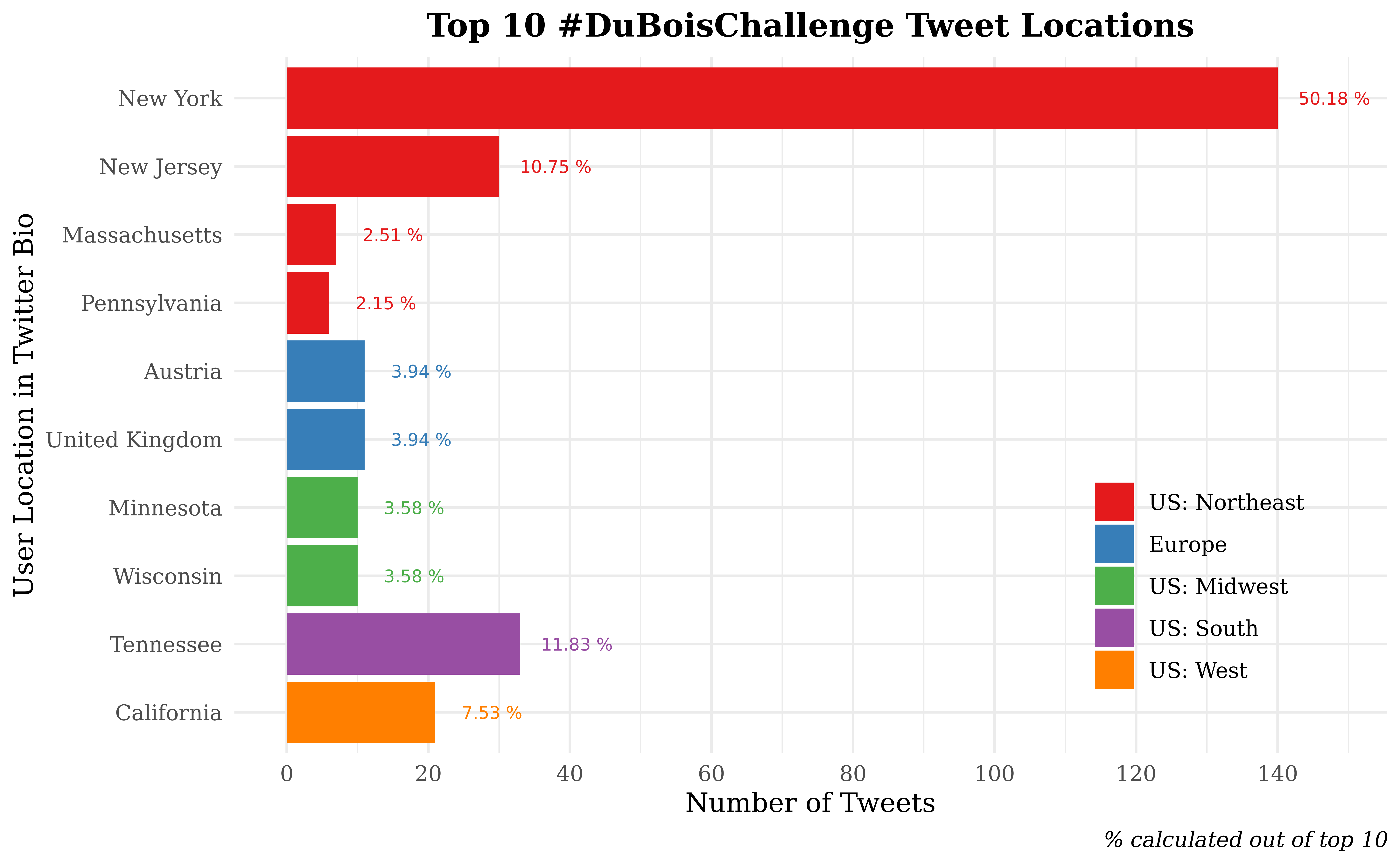
In our first visualization, we will investigate the location character
variable. Due to the self-reported nature of location, many of the
entries are jokes, ambiguous, or in inconsistent formats. To address the
latter problem, we had to perform manual cleaning - US tweets tend to
record the state with some use of city names while international tweets
use a mixture of country and city labels. In order to standardize, we
converted US cities into their respective states and converted
significant foreign cities into country groups. While comparing states
and countries is atypical, the majority of the observed tweets are in
the US and the use of states allows tweets from other countries to be
studied. We proceed to count our cleaned location variable and narrow
the list to the top 10 entries. In order to display counts for discrete
location names, we chose to utilize a bar plot stratified into and
colored by regions (SE, SW, NE, NW, international) and sorted in
descending order within regions. Further, we’ve included a text layer
with the percentage of each bar out of the total tweets from the top 10
locations.
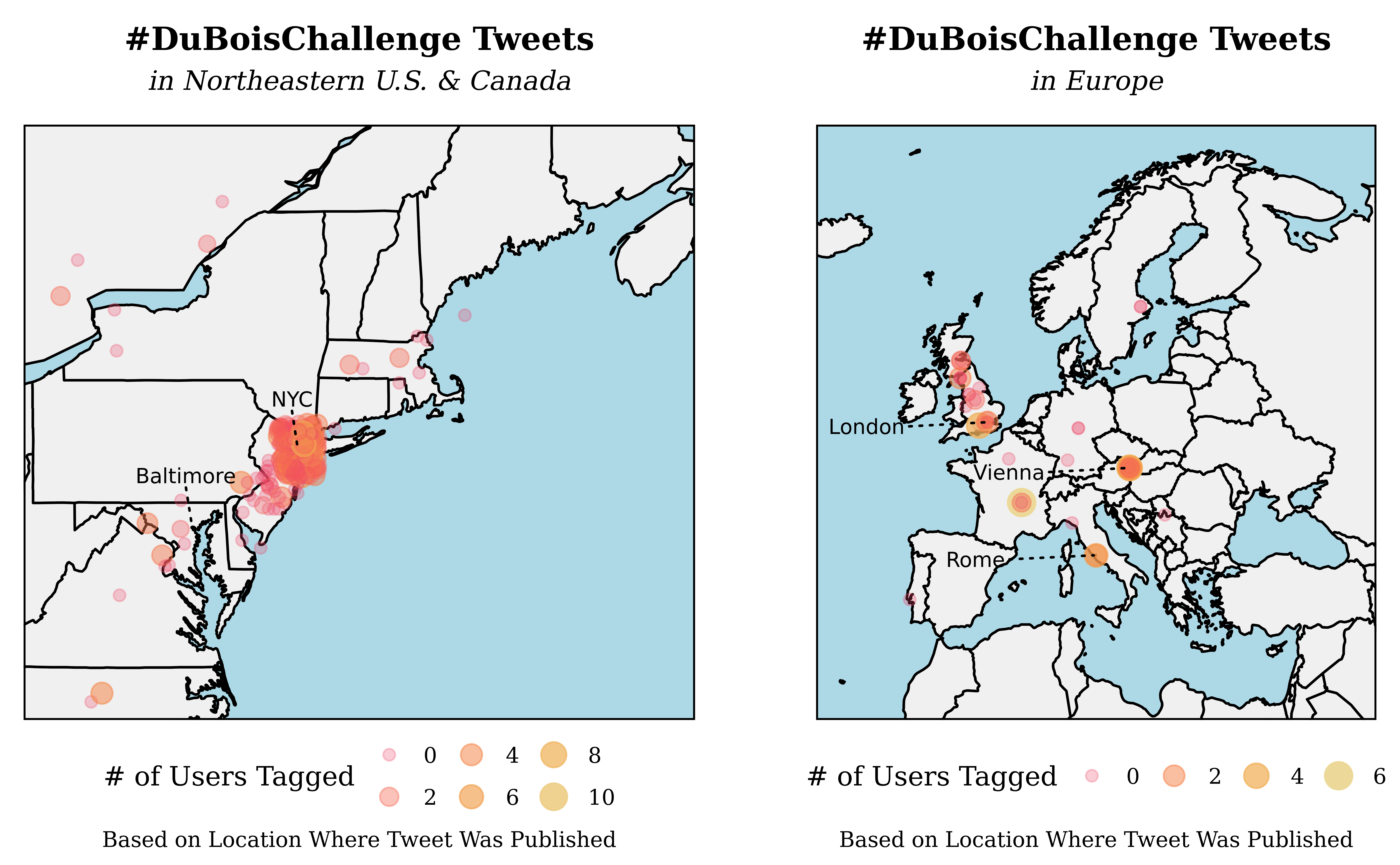
Our second visualization aims to display which areas of the world
published the most tweets during the challenge and how the number of
tags in a tweet might vary across the globe: the map format arose as a
natural candidate due to the need to plot coordinates and our goal of
comparing geographical regions. Rather than create an overcrowded world
map, we instead chose to use the long and lat location variables to
form two maps - one of the Northeastern US and one of Europe - which
each display a layer of country border data, a layer of points, and a
layer of annotations. Each tweet point is colored, sized, and given
transparency values via mapping to tag_count, a variable formed by
counting the occurrence of @user strings within tweet content.
Further, each point is given random noise by geom_jitter() in order to
alleviate some of the extreme clustering of points around NYC and the
southern UK.
Analysis
tweets <- tweets %>%
  mutate(tag_count = str_count(content, "@"))

tweets_locations <- tweets %>%
  filter(!str_detect(location, "@"), !str_detect(location, ":")) %>%
  mutate(
    location_pre_comma = gsub(",.*", "", location),
    location_pre_comma = case_when(
      location_pre_comma == "北京" ~ "Beijing",
      location_pre_comma == "God's earth" ~ "NA",
      location_pre_comma == "The City College of New York" ~ "New York",
      location_pre_comma == "World" ~ "NA",
      location_pre_comma == "he/they" ~ "NA",
      location_pre_comma == "At the home office" ~ "NA",
      location_pre_comma == "Deutschland" ~ "Germany",
      location_pre_comma == "Distrito Federal" ~ "Mexico City",
      location_pre_comma == "down in dey wid em" ~ "NA",
      location_pre_comma == "Forde-Obama Hall" ~ "NA",
      location_pre_comma == "France & UK" ~ "NA",
      location_pre_comma == "Lil’ Rudyshire" ~ "NA",
      location_pre_comma == "MIT" ~ "Boston",
      location_pre_comma == "New Yorker" ~ "New York",
      location_pre_comma == "OAK / NYC / ATL / The World" ~ "NA",
      location_pre_comma == "SP" ~ "NA",
      location_pre_comma == "Toronto || Ottawa" ~ "NA",
      location_pre_comma == "Tx" ~ "Texas",
      location_pre_comma == "UK" ~ "United Kingdom",
      location_pre_comma == "USA" ~ "United States",
      location_pre_comma == "Worldwide" ~ "NA",
      TRUE ~ location_pre_comma
    ),
    plot_state = case_when(
      location_pre_comma == "Nashville" ~ "Tennessee",
      location_pre_comma == "Merced" ~ "California",
      location_pre_comma == "Vienna" ~ "Austria",
      location_pre_comma == "Madison" ~ "Wisconsin",
      location_pre_comma == "Minneapolis" ~ "Minnesota",
      location_pre_comma == "Philadelphia" ~ "Pennsylvania",
      location_pre_comma == "Boston" ~ "Massachusetts",
      location_pre_comma == "London" ~ "United Kingdom",
      location_pre_comma == "Edinburgh" ~ "United Kingdom",
      location_pre_comma == "Amherst" ~ "Massachusetts",
      location_pre_comma == "Buffalo" ~ "New York",
      location_pre_comma == "Cambridge" ~ "Massachusetts",
      location_pre_comma == "San Diego" ~ "California",
      TRUE ~ as.character(location_pre_comma)
    )
  )

top_10_locations <- tweets_locations %>%
  count(plot_state) %>%
  arrange(desc(n)) %>%
  filter(plot_state != "NA") %>%
  head(10) %>%
  mutate(
    region = case_when(
      plot_state == "New York" ~ "US: Northeast",
      plot_state == "New Jersey" ~ "US: Northeast",
      plot_state == "Pennsylvania" ~ "US: Northeast",
      plot_state == "Massachusetts" ~ "US: Northeast",
      plot_state == "Tennessee" ~ "US: South",
      plot_state == "California" ~ "US: West",
      plot_state == "Austria" ~ "Europe",
      plot_state == "United Kingdom" ~ "Europe",
      plot_state == "Wisconsin" ~ "US: Midwest",
      plot_state == "Minnesota" ~ "US: Midwest"
    ),
    region = fct_relevel(region, c(
      "US: Northeast", "Europe", "US: Midwest", "US: South",
      "US: West"
    )),
    plot_state = fct_relevel(plot_state, c(
      "New York", "New Jersey", "Massachusetts",
      "Pennsylvania", "Austria", "United Kingdom",
      "Minnesota",
      "Wisconsin", "Tennessee", "California"
    )),
    plot_state = fct_rev(plot_state),
    percent_tweets = paste(round(n / sum(n), 4) * 100, "%")
  )

northeast_tweets <- tweets %>%
  filter(
    long <= -70,
    long >= -90,
    lat <= 46,
    lat >= 20
  )
europe_tweets <- tweets %>%
  filter(
    long >= -20 & long <= 45,
    lat >= 30 & lat <= 73
  )

world_map <- ne_countries(
  scale = "medium", type = "map_units",
  returnclass = "sf"
)
us_map <- map_data("state")
canada_map <- map_data("world", "canada")

US_locations <- tribble(
  ~city, ~lat, ~long,
  "NYC", 40.7128, -74.0060,
  "Baltimore", 39.2904, -76.6122
)

EU_locations <- tribble(
  ~city, ~lat, ~long,
  "London", 51.5074, -0.1278,
  "Vienna", 48.2082, 16.3738,
  "Rome", 41.9028, 12.4964
)
ggplot(data = top_10_locations, aes(y = plot_state, x = n, fill = region)) +
  geom_col() +
  geom_text(aes(label = percent_tweets, color = region),
    size = 2.5,
    nudge_x = 8,
    show.legend = FALSE
  ) +
  scale_fill_brewer(palette = "Set1") +
  scale_color_brewer(palette = "Set1") +
  scale_x_continuous(
    breaks = c(0, 20, 40, 60, 80, 100, 120, 140, 160, 180, 200)
  ) +
  labs(
    title = "Top 10 #DuBoisChallenge Tweet Locations",
    caption = "% calculated out of top 10",
    x = "Number of Tweets",
    y = "User Location in Twitter Bio",
    fill = "Location"
  ) +
  theme_minimal() +
  theme(
    plot.title = element_text(hjust = 0.5, face = "bold"),
    plot.caption = element_text(face = "italic"),
    legend.title = element_blank(),
    legend.position = c(.837, .25),
    text = element_text(family = "Times New Roman")
  )
set.seed(1234)

NEmap <- ggplot() +
  geom_polygon(
    data = canada_map,
    aes(x = long, y = lat, group = group),
    fill = "#F0F0F0",
    color = "black"
  ) +
  geom_polygon(
    data = us_map,
    aes(x = long, y = lat, group = group),
    fill = "#F0F0F0", color = "black"
  ) +
  geom_jitter(
    data = northeast_tweets,
    width = 0.5, height = .5,
    aes(
      x = long, y = lat, size = tag_count, color = tag_count,
      alpha = tag_count
    )
  ) +
  labs(
    title = "#DuBoisChallenge Tweets",
    subtitle = "in Northeastern U.S. & Canada\n",
    caption = "Based on Location Where Tweet Was Published",
    size = "# of Users Tagged",
    color = "# of Users Tagged",
    alpha = "# of Users Tagged"
  ) +
  theme_void() +
  scale_color_continuous_sequential(
    palette = "OrYel", rev = FALSE,
    breaks = c(0, 2, 4, 6, 8, 10)
  ) +
  scale_size_continuous(range = c(2, 5), breaks = c(0, 2, 4, 6, 8, 10)) +
  scale_alpha_continuous(range = c(.27, 1), breaks = c(0, 2, 4, 6, 8, 10)) +
  guides(
    color = guide_legend(),
    size = guide_legend(),
    alpha = guide_legend()
  ) +
  theme(
    plot.title = element_text(hjust = 0.5, face = "bold"),
    plot.subtitle = element_text(hjust = 0.5, face = "italic"),
    plot.caption = element_text(hjust = 0.5),
    legend.position = "bottom",
    panel.border = element_rect(color = "black", fill = NA, size = .75),
    panel.background = element_rect(color = "black", fill = "lightblue"),
    text = element_text(family = "Times New Roman")
  ) +
  geom_text_repel(
    data = US_locations,
    aes(x = long, y = lat, label = city),
    size = 3, nudge_x = -0.15,
    nudge_y = 0.95,
    segment.linetype = "dotted"
  ) +
  coord_map(
    xlim = c(-80, -65),
    ylim = c(36, 46)
  )

Euromap <- ggplot() +
  geom_sf(data = world_map, fill = "#F0F0F0", color = "black") +
  geom_jitter(
    data = europe_tweets,
    aes(
      x = long, y = lat, size = tag_count, color = tag_count,
      alpha = tag_count
    )
  ) +
  coord_sf(xlim = c(-20, 45), ylim = c(30, 73), expand = FALSE) +
  labs(
    title = "#DuBoisChallenge Tweets",
    subtitle = "in Europe\n",
    caption = "Based on Location Where Tweet Was Published",
    size = "# of Users Tagged",
    alpha = "# of Users Tagged",
    color = "# of Users Tagged"
  ) +
  theme_void() +
  scale_color_continuous_sequential(
    palette = "OrYel", rev = FALSE,
    breaks = c(0, 2, 4, 6, 8, 10)
  ) +
  scale_size_continuous(range = c(2, 5), breaks = c(0, 2, 4, 6, 8, 10)) +
  scale_alpha_continuous(range = c(.27, 1), breaks = c(0, 2, 4, 6, 8, 10)) +
  guides(
    color = guide_legend(),
    size = guide_legend(),
    alpha = guide_legend()
  ) +
  theme(
    plot.title = element_text(hjust = 0.5, face = "bold"),
    plot.subtitle = element_text(hjust = 0.5, face = "italic"),
    plot.caption = element_text(hjust = 0.5),
    legend.position = "bottom",
    panel.border = element_rect(color = "black", fill = NA, size = .75),
    panel.background = element_rect(color = "black", fill = "lightblue"),
    text = element_text(family = "Times New Roman")
  ) +
  geom_text_repel(
    data = EU_locations,
    aes(x = long, y = lat, label = city),
    size = 3,
    nudge_x = -14, nudge_y = -0.3,
    segment.linetype = "dotted"
  )

(NEmap + theme(plot.margin = unit(c(0,25,0,0), "pt"))) +
(Euromap + theme(plot.margin = unit(c(0,0,0,25), "pt")))
Discussion
Our first plot clearly shows that most of the Twitter challenge activity is occurring in the US; eight of the ten locations were US states even though these states were being directly compared to entire foreign countries. The only international locations in the plot - the UK and Austria - account for merely 7.88% out of the top 10 locations. This confirms our initial assumption that most people interested in and interacting with this challenge are in the US. Domestically, four of the top ten locations are northeastern states: an unsurprising find when considering population figures and Du Bois’s legacy in NYC. Moving forward in our analysis, we chose to focus on the Northeast and Europe to study their users and how they may engage each other differently in the two regions.
Our second visualization is a set of two maps of the Northeastern United
States and Europe with point coloring/sizing by the number of @tags. One
advantage of the long and lat variable over the previous plot’s
location is that we can more precisely display areas where tweet
clustering occurs rather than user home locations. For example, the
Northeast map shows the dominant NYC cluster extending outwards towards
Newark, NJ while another small cluster exists around Baltimore. In
Europe, there is a low-density cluster centered in London and small
clusters in major cultural cities such as Rome and Vienna, but the
overall number of tweets is far lower than in the US. A glance at the
tag_count mappings proves more fruitful - in both maps, the low tag
counts are most frequent in all regions, but high tag counts appear
exclusively in cluster centers. Since these clusters are all
cosmopolitan cities, it’s reasonable to speculate that their users would
have the most ties to other participants and thus the ability to tag
more people per tweet. However, due to the low number of observations
and the correlational nature of the data, we lack the evidence to make a
causal claim that cosmopolitan cities generate more tags (and thus more
user interactions). Further, our metric to study inter-user
interactions, tag_count, is an imperfect proxy for how users speak.
Not every tag is a meaningful connection between users and the
relationship between tagging and user interaction is confounded by this
ambiguity.
Twitter Posting Mediums and Audience Engagement
What is the relationship between the device that is used to publish a tweet and how the audience engages with the author?
Introduction
We’re interested in how the different “mediums” of publishing to Twitter are related to the success of the tweet. Based on our own anecdotal experiences, we believe that tweets from traditional computers may be constructed less impulsively than mobile tweets. Further, there are socioeconomic factors tied to which device one picks as well as content considerations; one can easily publish #DuBoisChallenge commentary from an iPhone, but a full plot submission would be exceedingly difficult. By mapping out how such limitations influence audience response, we hope to discover which devices are best-suited for both low-visibility commentary and high-visibility challenge submissions.
For this question, we intend to explore how various audience approval
metrics vary with the type of device used by the tweet author. To do
this, we’ll begin by manipulating the text variable - a character of
the platform/access point that the device used to access Twitter - by
parsing it through case_when with specific string detection. Then, we
will examine followers and like_count and their relationship with
devicetype. Unlike the other two variables, the number of followers is
not exclusively set by one tweet, but by the user’s long-term success.
In recognition of this disparity, we intend to display the relationship
between followers and devicetype with groupings by username and
avg_followers across all of a user’s tweets in the data.
Approach
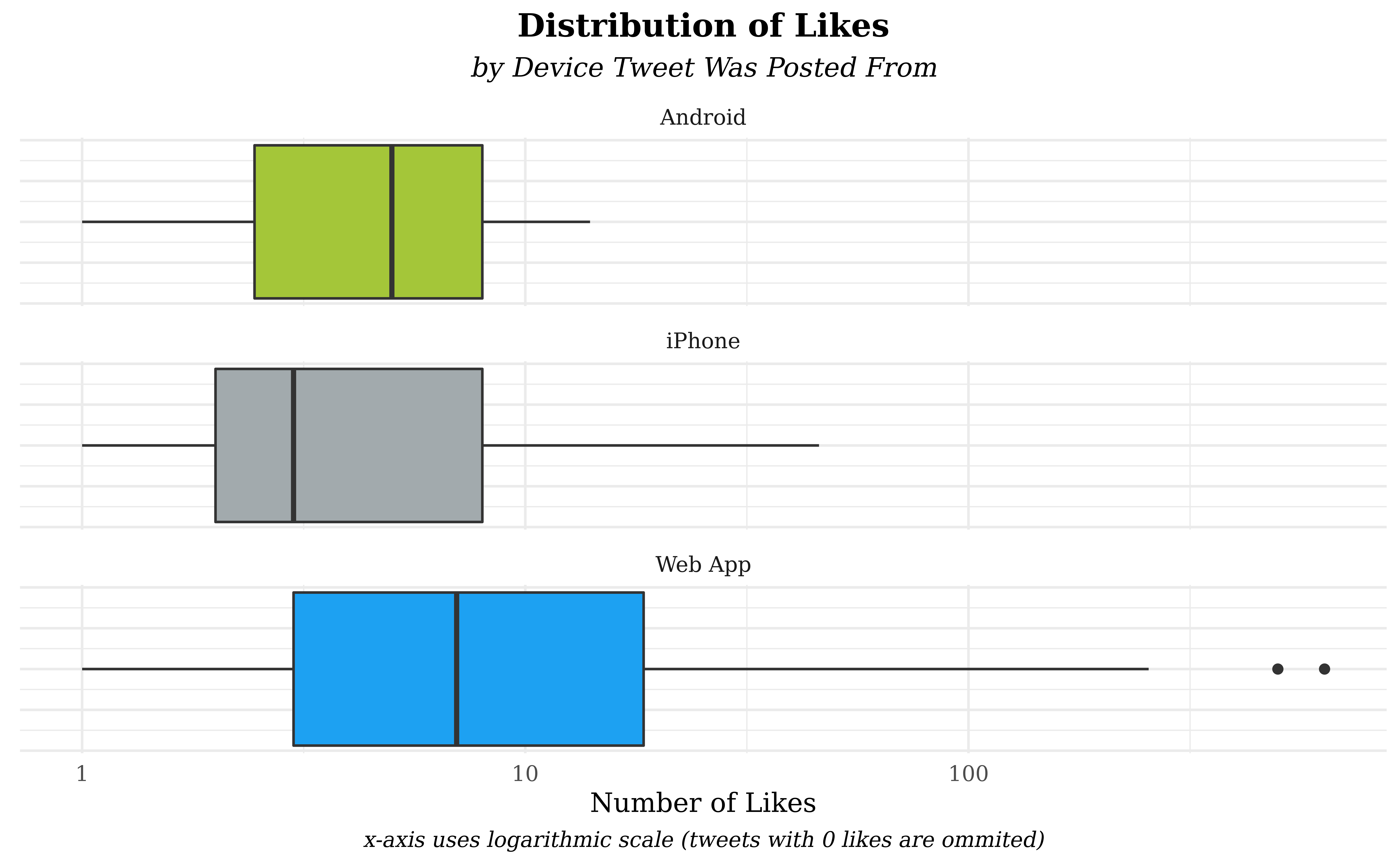
Our first plot dives into the relationship between like_count and
devicetype by showing side-by-side boxplots faceted by devicetype;
our goal is to directly compare how different platforms may generate
likes and boxplots are especially well-suited to comparing similar
distributions. Further, the measures of central tendency - medians and
quartiles - are easier to view in boxplot form and better communicate
the audience’s reaction to a tweet. Boxplots cannot accommodate large
numbers of groups easily, however, so we chose to narrow our analysis to
the three device types that form the overwhelming majority of the data
(iPhone, Android, and Web App). There is an incredibly strong right skew
in the like counts, but applying a log-transform on the x-axis allows
all the data to be visible.
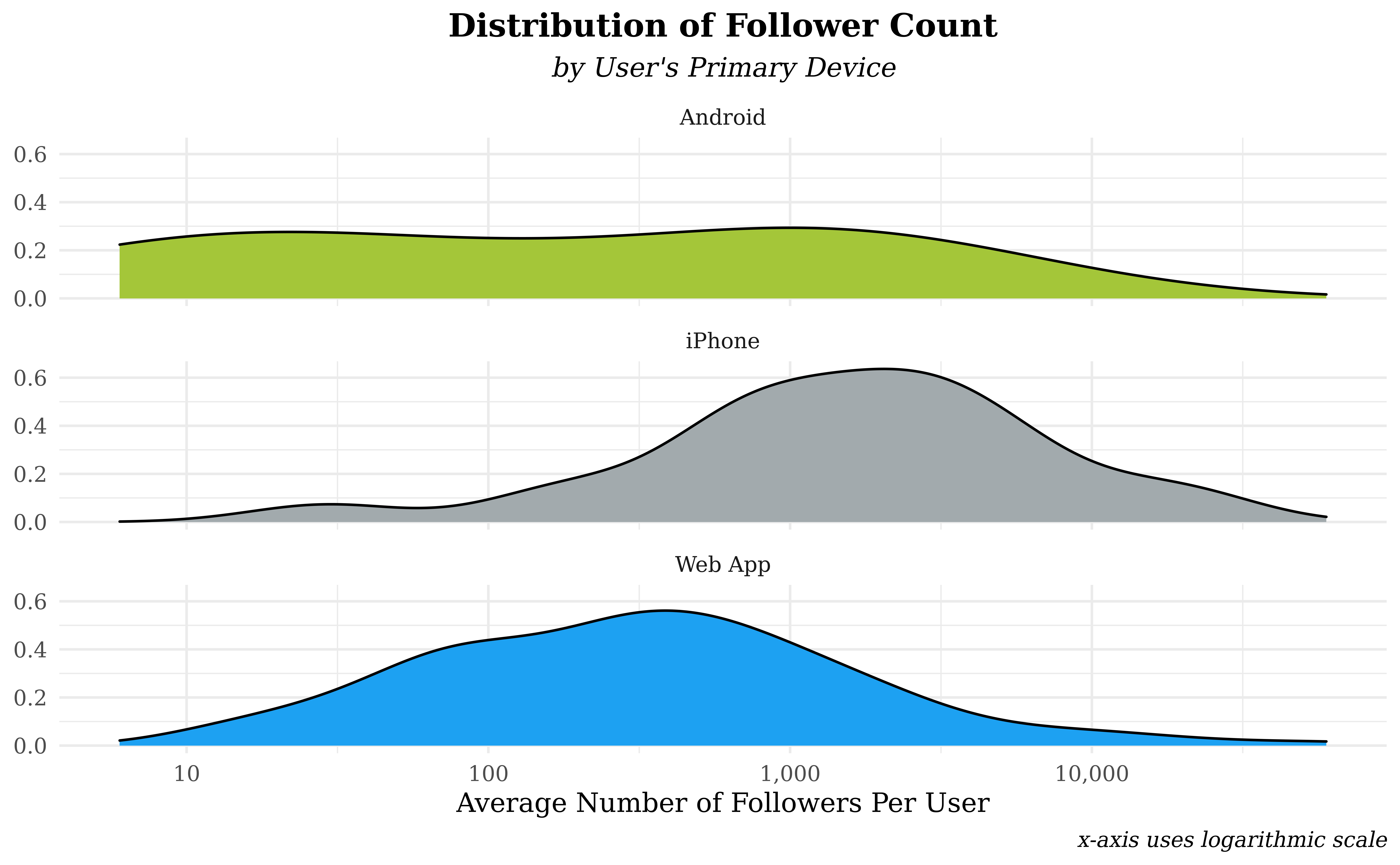
Our second plot shows the distribution of followers count per user
stratified across the three most popular device types. In order to
assign each user a single follower count and device type, we use the
average number of followers across all their tweets (avg_followers)
and assign a device type based on the user’s most common way to post on
twitter. Thus, the plot examines the relationship between the primary
device that a user owns and their average number of followers while
participating in the TidyTuesday competition. We chose to show the
distributions of follower count as density plots in order to better
examine the shapes of the distributions; we’re interested in not only
typical users, but also “extreme” users from the right tail of the
distribution. In order to make these extreme values more visible, a log
scale is applied to average follower counts.
Analysis
tweets <- tweets %>%
  mutate(devicetype = case_when(
    str_detect(text, "Twitter Web App") ~ "Web App",
    str_detect(text, "Twitter for iPhone") ~ "iPhone",
    str_detect(text, "Twitter for Android") ~ "Android",
    str_detect(text, "Buffer") ~ "Buffer",
    str_detect(text, "Twitter for iPad") ~ "iPad",
    str_detect(text, "TweetDeck") ~ "TweetDeck",
    str_detect(text, "Crowdfire App") ~ "Crowdfire App",
    str_detect(text, "Twitter for Mac") ~ "Mac"
  ))

tweets_device <- tweets %>%
  filter(devicetype == "iPhone" |
    devicetype == "Web App" |
    devicetype == "Android")

users_and_devicetype <- tweets %>%
  group_by(username) %>%
  select(username, devicetype) %>%
  count(devicetype) %>%
  arrange(desc(n)) %>%
  slice(1) %>%
  select(-n)

users_and_avg_follower <- tweets %>%
  group_by(username) %>%
  summarise(avg_followers = mean(followers))

joined_devices_follower <- inner_join(users_and_devicetype,
  users_and_avg_follower,
  by = "username"
) %>%
  filter(devicetype == "iPhone" |
    devicetype == "Web App" |
    devicetype == "Android")
# Plot drops NAs and tweets with 0 likes since log(0) is undefined
ggplot(data = tweets_device, aes(x = like_count, fill = devicetype)) +
  facet_wrap(~devicetype, ncol = 1) +
  geom_boxplot(show.legend = FALSE) +
  scale_fill_manual(values = c("#a4c639", "#A2AAAD", "#1DA1F2")) +
  scale_x_log10() +
  labs(
    title = "Distribution of Likes",
    subtitle = "by Device Tweet Was Posted From",
    caption = "x-axis uses logarithmic scale (tweets with 0 likes are ommited)",
    x = "Number of Likes",
    y = NULL
  ) +
  theme_minimal() +
  theme(
    plot.title = element_text(hjust = 0.5, face = "bold"),
    plot.subtitle = element_text(hjust = 0.5, face = "italic"),
    plot.caption = element_text(face = "italic", hjust = 0.5),
    axis.ticks = element_blank(),
    axis.text.y = element_blank(),
    text = element_text(family = "Times New Roman")
  )
# Plot drops NAs
ggplot(
  data = joined_devices_follower,
  aes(x = avg_followers, fill = devicetype)
) +
  geom_density(show.legend = FALSE) +
  facet_wrap(. ~ devicetype, nrow = 3) +
  theme_minimal() +
  scale_x_log10(labels = label_number(big.mark = ",")) +
  scale_fill_manual(values = c("#a4c639", "#A2AAAD", "#1DA1F2")) +
  scale_y_continuous(labels = label_number(accuracy = .1)) +
  labs(
    title = "Distribution of Follower Count",
    subtitle = "by User's Primary Device",
    caption = "x-axis uses logarithmic scale",
    x = "Average Number of Followers Per User",
    y = NULL
  ) +
  theme(
    plot.title = element_text(hjust = 0.5, face = "bold"),
    plot.subtitle = element_text(hjust = 0.5, face = "italic"),
    plot.caption = element_text(face = "italic"),
    text = element_text(family = "Times New Roman")
  )
Discussion
In our first visualization, we immediately see strong skew in all three device types and their number of likes - the presence of the logarithmic scale implies that a “symmetric” box is actually strongly right-skewed. The strongest right skew and highest median number of likes belongs to Web App tweets. One possible explanation is the challenge’s format - most tweets are either going to be a detailed plot recreation or commentary on another plot. We suspect that plots are disproportionately published by web apps due to screen size required to work with data visualization - since plots will generally earn more viewership than commentary, web app posts are more likely to attain superstar status.
Our second distribution examines average followers rather than likes in order to assess long-term success rather than individual post success. Overall, Android tweets have a flat distribution while iPhones and Web Apps have left and right skew in the plot, respectively. However, the use of a logarithmic scale means that these shapes correspond to strongly right-skewed data. Of these distributions, Web App tweets are skewed the furthest to the right followed by Androids and iPhones. In terms of modal values in the distributions, iPhones have the sharpest and largest peak followed by a slightly lower mode for Web Apps and no clear peak for Android tweets.
We expected likes and followers to have a similar relationship with
devicetype where the device that garners more likes would also attract
the most followers. Surprisingly, we see that Web Apps are responsible
for the “superstar” tweets with a high like count while iPhone users
tend to draw the most followers. We have two possible explanations for
these effects. An explanation for the web apps might be that it is much
easier to type out and structure tweets on a computer than it is on a
phone. In fact, one study from Grammarly showed that people make five
times as many writing errors on their phone than on a PC. This may be
one potential reason why tweets authored on a Web App device seem to
attract more likes than those authored on a mobile device like an
Android or iPhone – they could be written more methodically and
profoundly. In regards to the followers, there are socioeconomic
considerations; iPhones are more expensive than most computers or
Androids and higher socioeconomic status could lead to more free time to
create tweets on a regular basis. However, we lack data on both writing
times and the cost of a user’s device; thus, we can’t make causal
conclusions between device and tweet success, but the above pattern
warrants future study with more experimental data.
Presentation
Our presentation can be found here.
Data
Starks, A, Hillery, A, Tyler, S 2021, Du Bois and Juneteenth revisited: TidyTuesday week 8 of 2021, electronic dataset, tidytuesday, retrieved 13 September 2021, https://github.com/rfordatascience/tidytuesday/blob/master/data/2021/2021-06-15/readme.md.